Walkadoo Responsive Update
- Date
- 2018
- Team
- MeYou Health
- Industry
- Consumer Wellness
- Platforms
- Web
Rich icons, textured backgrounds, and shiny buttons were all the rage when the first version of Walkadoo was released out of the beta in 2012. By 2018, some of our customers and our own team at MeYou Health perceived those stylistic choices as decidedly outdated. Equally bothersome was that Walkadoo’s front-end was not responsive and offered a poor user experience on phone and tablet-sized screens.
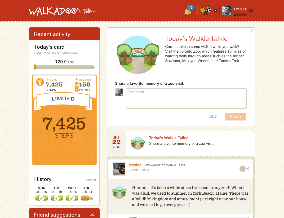
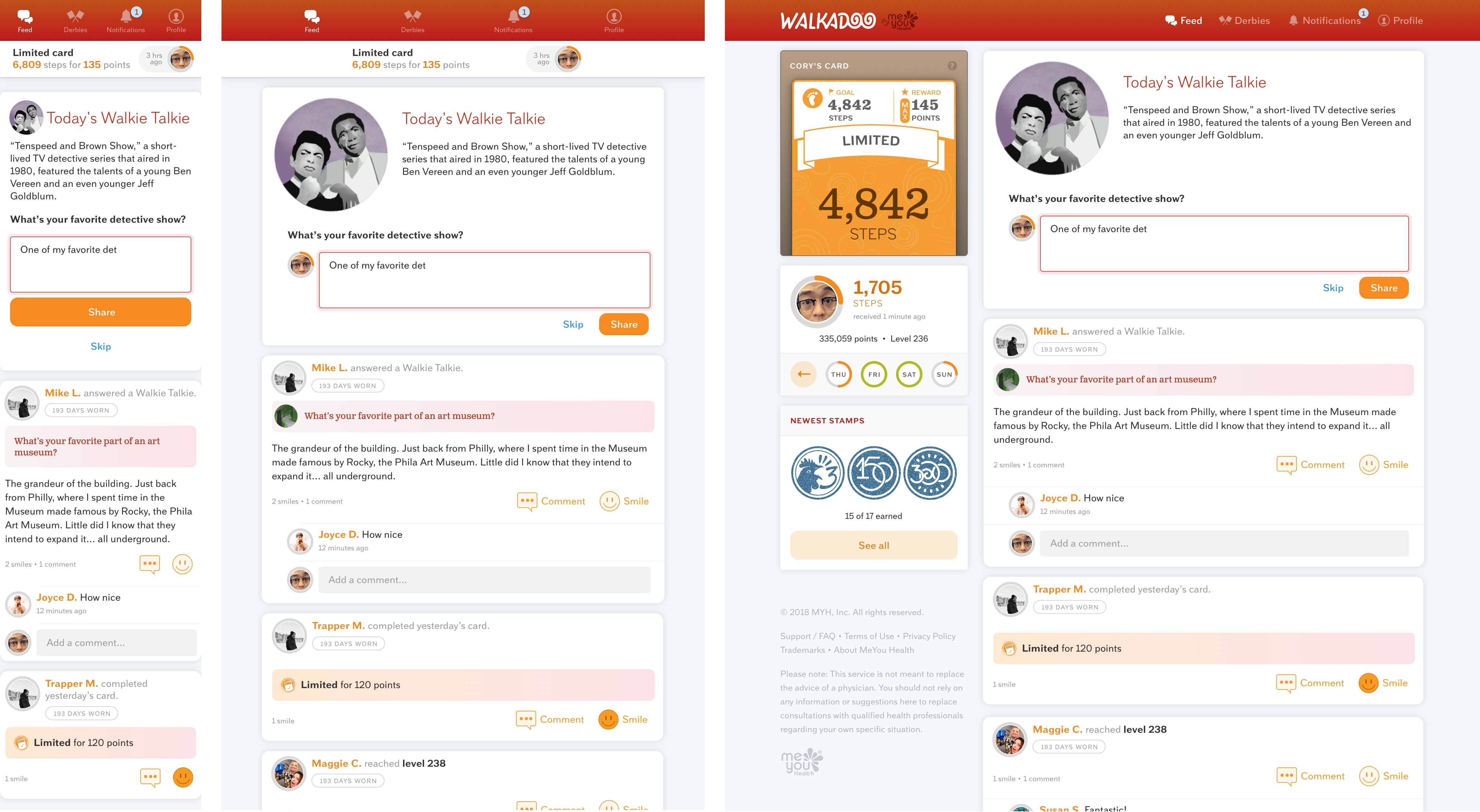
Walkadoo is a social and gamified walking experience that motivates participants who wear any one of the supported step and fitness trackers to walk more every day. We were not interested in a re-branding the product. The goal was to make Walkadoo work on phone-sized screens as well as it does on the desktop and to bring the look & feel up to date stylistically. We wanted to retain both Walkadoo’s personality and core interaction patterns while bringing it in line with our participant and customer expectations set by other contemporary products. I first mapped out some more specific themes for myself from that high-level goal:
- Start by designing for mobile first
Designing the other way around, i.e. trying to “fix” whatever broke when big layouts shrunk to small screens was the likely root cause of poor experience on mobile.
- Catch up design with the technology
The most visible symptom of this was the implementation of “infinite scroll” on the dashboard’s feed. The capability was great but initial designs did not anticipate it. As a result, all footer content including support links was inaccessible from core pages. Whenever you scrolled to the footer, it escaped your view again because new feed items loaded above it.
- Update the look & feel
Revisit background colors and textures. Reconsider the amount of detail and shading, especially in navigation icons.
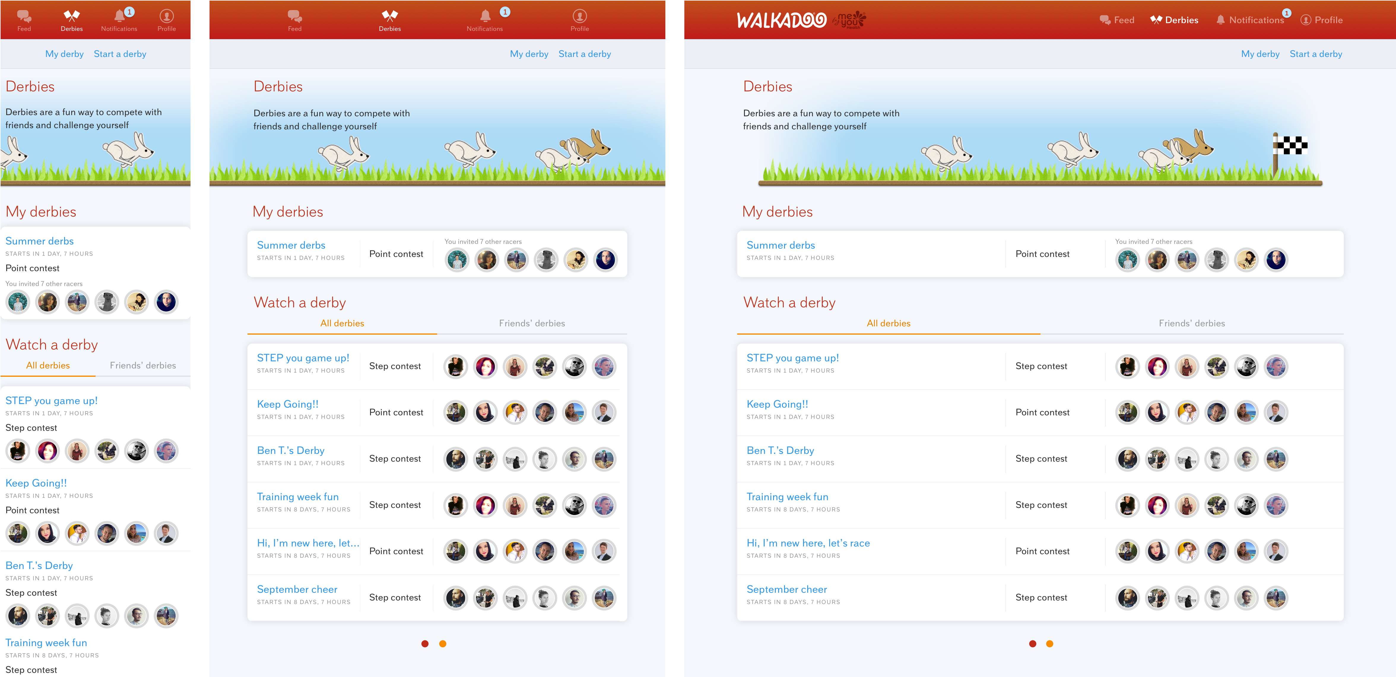
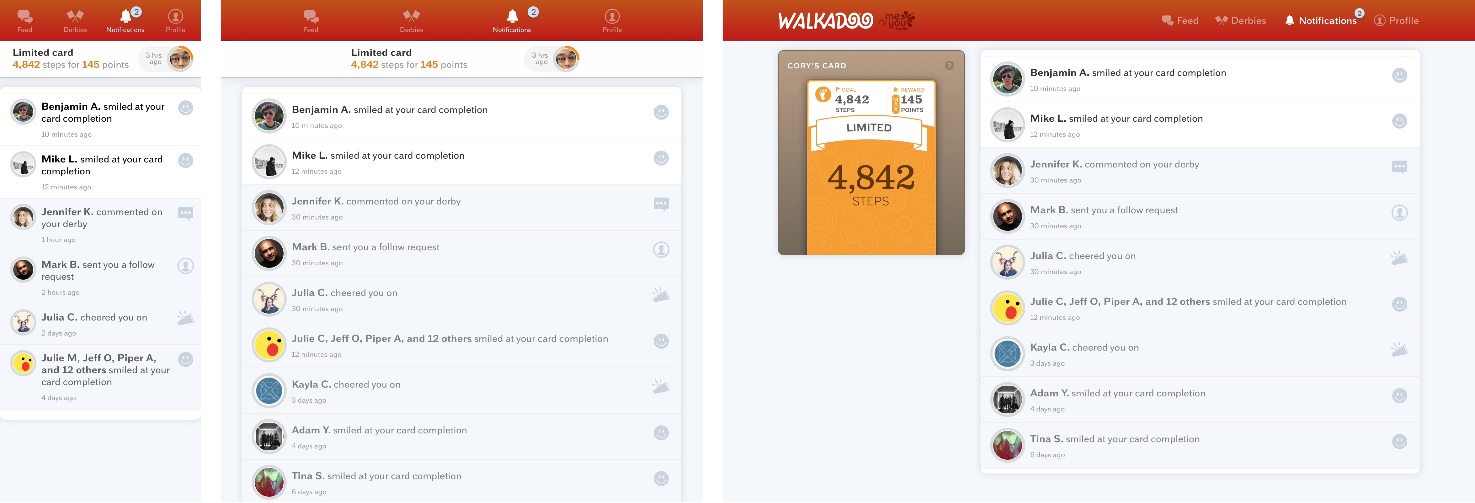
Over the course of two sprints, I was able to develop a new interface style, apply it to core destinations (the Walkie Talkie feed, derbies, notifications, user profile), and review it with the team.

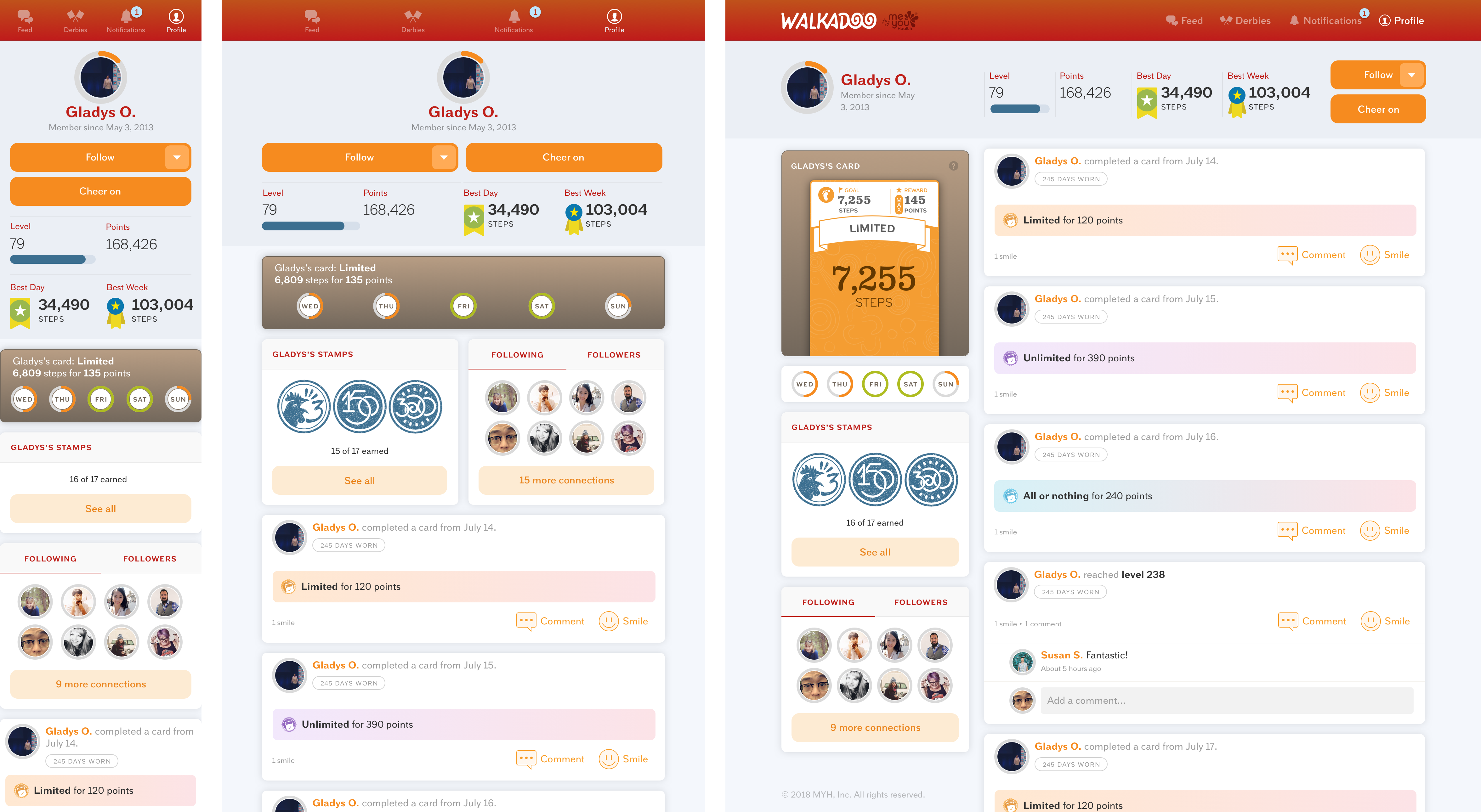
For me, the “feel” part of the look & feel has to do with the tone of interface copy but also with the personality of animations. Our content was imbued with personality. It was time to introduce animations. Interactions that should feel rewarding and fun, like smiling on another participant’s post or activity, were good candidates.
Very common interactions like loading new feed items or typing and posting content were also good candidates. Addition of these animated elements brought a sense of novelty that compensated for reduced intricacy when the user interface became simpler.
The devil was in the details. One set of mockups for each flow did not meet the actual complexity of those flows. Mapping out existing states of different screen and especially smaller widgets was the more time-consuming part of the effort. To take only a few examples, consider the mini card history below. It was easy to overlook that participants who just signed up do not have a days-long step history yet (middle). Or that a step tracker issue might have gotten in a way of having any step data for some days (right).

It was hard to remember how many different states the derby widget could have. The answer was five.

Similarly, there were three versions of the primary navigation depending on the user type.
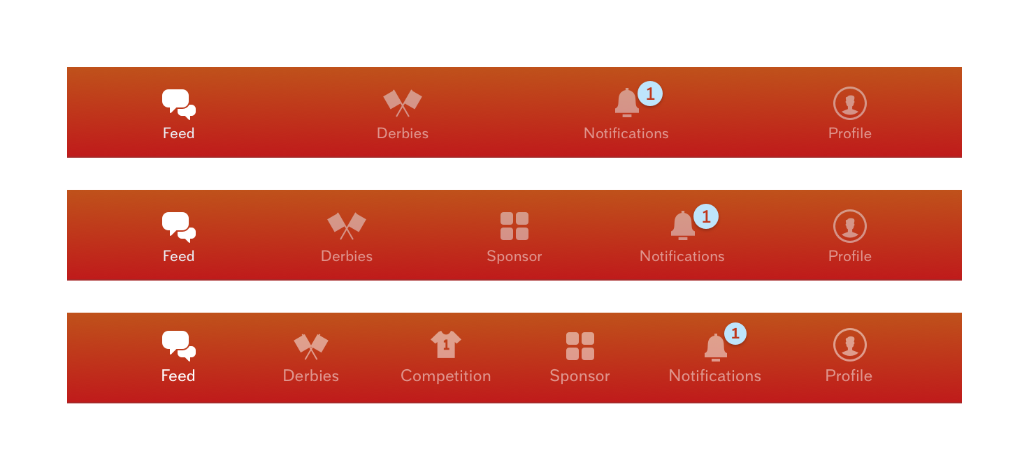
I love having access to products’ code bases because it allows me to more efficiently map out all the states I need to design for. Spelunking through localization and test files in the code base was a good way to discover those. It is why I preach to designers about running a development environment on their computers.
It took a couple of more sprints for Collin, the front-end engineer, and myself to propagate the styling to all flows (e.g., onboarding, device ordering, settings, etc.) but the process went smoothly for both of us. I was able to map out most states that needed design attention and Collin pointed out those few that I had missed.
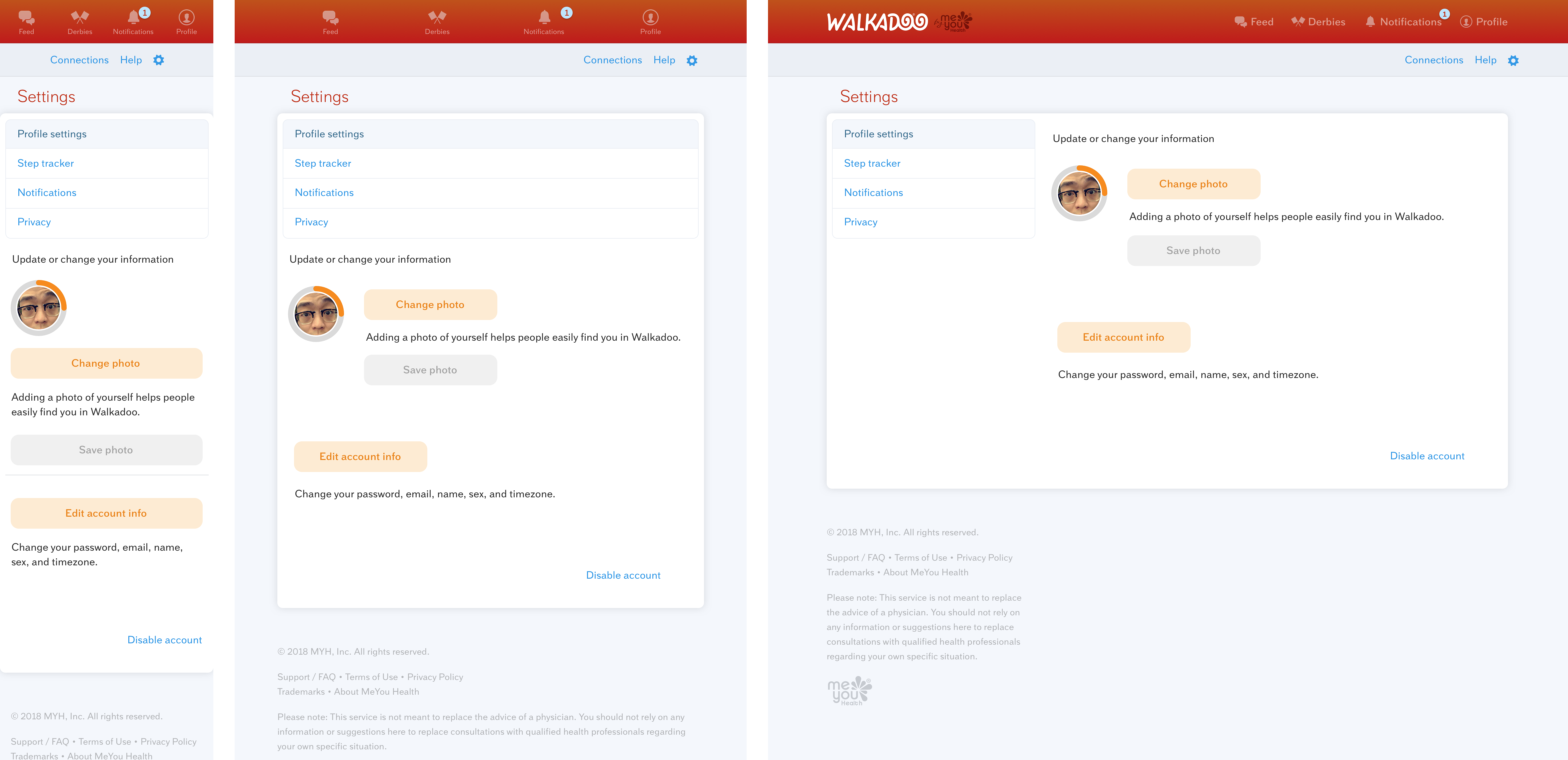
The customers and our team were both enthusiastic about the updates. This was an atypical way of working for me at MeYou Health. We favored, in principle, iterative evolution over notions of re-designs (Cheering-on in team competitions is a good example). It does go to show that with sound foundations, a product can continue to engage users even when neglected for some time. And with clear goals and expectations, it can be brought up to date rather quickly.