Leadership & Team Building

- Date
- 2016
- Team
- MeYou Health
In 2016, MeYou Health had 4 product designers and 4 in-market products. I had developed a preference for working in a team structure where designers are embedded in small cross-functional product teams. I liked the strong sense of ownership this structure instilled, autonomy it enabled, and collaboration it demanded from designers who were each dedicated to one product team (in contrast to supporting or consulting on multiple products) so I maintained the structure when I took on the Head of Design role in 2015.
Despite its advantages at a company like ours, the embedded structure had its downsides. Recruiting “full-stack” designers (in contrast to designers with a singular expertise like UX or UI) was a challenge I managed to navigate with an intentional and thorough process. Another challenge was more latent: designers felt a bit isolated because their day-to-day rituals took place within their product team, leaving limited room to work with other designers. They liked their product team and felt informed about what other teams were doing but desired a sense of functional belonging – being a part of a design team too.
On a few occasions, designers saw opportunities for coordination to improve our collective product output. Marketing images for Apple’s and Google’s App Stores were one example: Some of our apps featured billboard-style callouts with description overlays while others showcased the app through unadulterated screen captures. Some would omit the iOS status bar from images while others would include it (along with inconsistent content). When I tasked designers to band together to define patterns and standards for how we ought to market apps in mobile app stores, I received such positive feedback about taking part in this small exercise that I started looking for other opportunities to engage designers with each other through cross-product work.
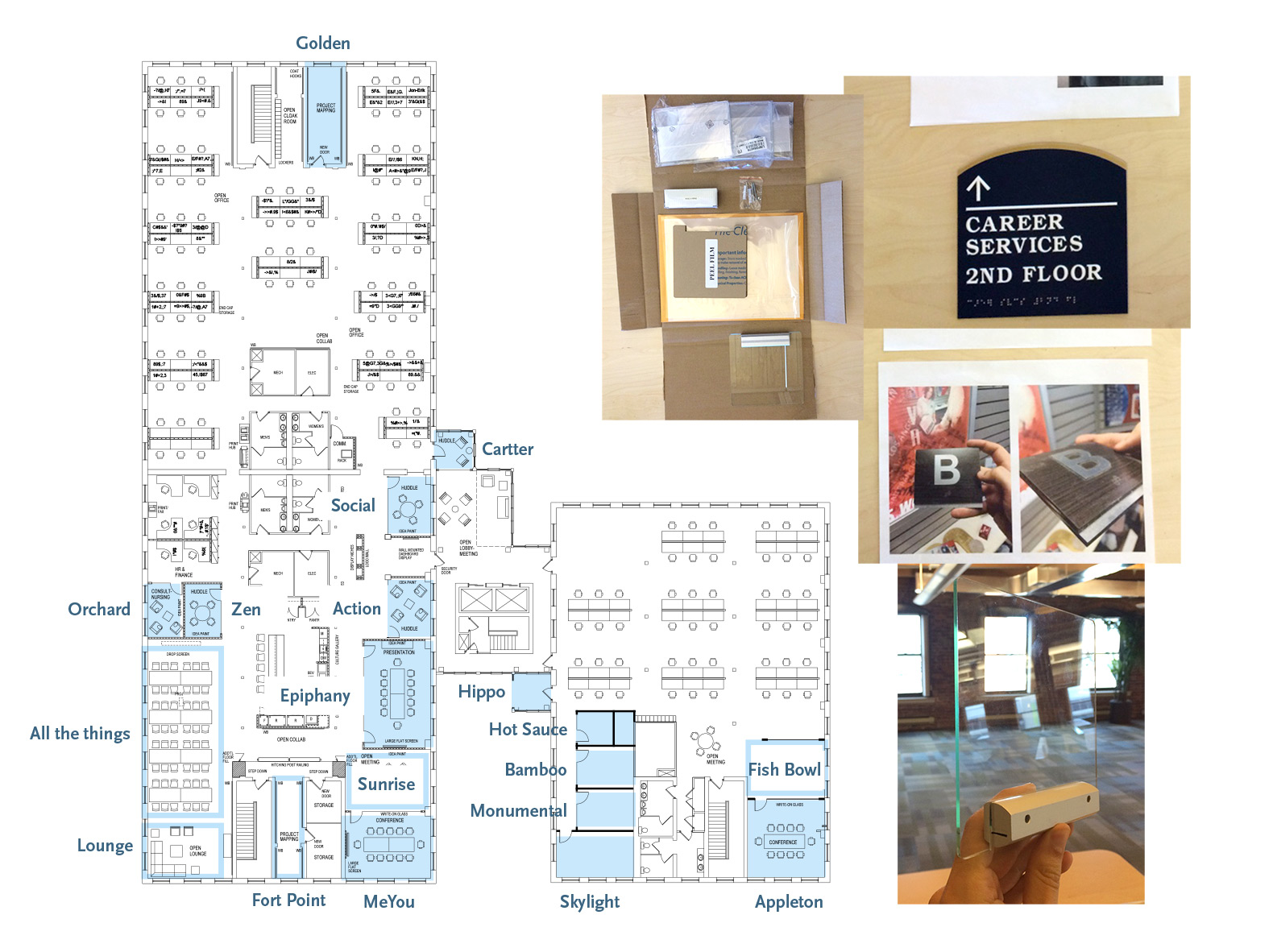
The opportunities, however, at that particular time were slim with short-term roadmaps for each product already established. At this time, the company had moved to a new office to accommodate recent rapid growth. This meant more conference rooms (everyone was excited about that!). It also meant IT had to set up rooms in Google Calendar for employees to book. The office manager had printed room names on sheets of 8.5 × 11" glued to glass doors with scotch tape, flapping whenever AC would kick in – a sight not as elegant as our newly renovated office space (I wish I had captured it on video.) Worse than the aesthetics was the impromptu naming scheme of “Conference Room 1, Conference Room 2,” etc. Few could remember which one was where, even weeks after moving in. Looking for a project that would create opportunities for designers to collaborate, I proposed to the leadership that our designers take on the task of designing better office signage as a team building exercise. With great help from Bill, our game designer, I worked with product designers, office manager, head of product, and general manager to create and approve a list of unique names that referenced the company’s history, our current neighborhood, and unique traits of physical office space.
The experience helped designers overcome their initial discomfort with both a highly ambiguous project and shared ownership over a feature that affected each of their respective products.

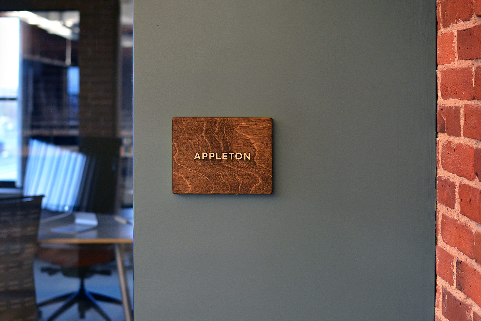
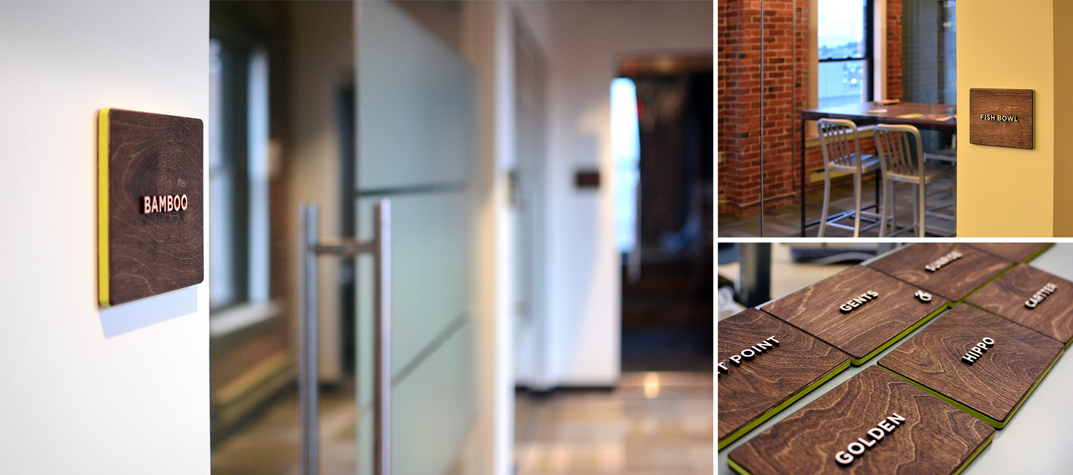
None of the product designers had experience creating environmental graphics so I purchased a few books for the team and we spent a couple of meetings looking at what good signage looks like. While designers explored different options for room ID signs, I asked them to order hardware samples to get a sense of different fabrication techniques. They found touching materials to be a welcome break from designing software all day long. When Sandy found an Etsy vendor that fabricated dimensional signs out of stained wood, we all knew we had a perfect fit for the exposed-brick and glass interior of the office. With both the sign layout and hardware chosen and each name assigned to a room, Sandy created production ready files for each of the 19 conference rooms, storage rooms, open collaboration spaces, and restrooms. I sent the files for fabrication.

This project, which sat outside any product roadmaps, fostered a sense of belonging to a design team. Relationships were established, which boosted designers’ engagement. The process of researching, ideating, editing, and executing outside of habitual product team environment was now familiar. When months later, a new need surfaced to create a single, centralized user account system that powered all 4 products, the experience gained applied directly to product outcomes. The experience helped designers overcome their initial discomfort with both a highly ambiguous project and shared ownership over a feature that affected each of their respective products. The company also gained an office signage system that many complimented. ▨