Photoworks
- Date
- Spring 2009
- Industry
- Consumer photo prints
- Platforms
- Web
- Scope
- Usability engineering, information architecture, visual design
PhotoWorks was one of the first services on the web to offer ordering of photo prints online. At the time a subsidiary of the Interactive division of American Greetings, PhotoWorks faced declining usage due to competition from services like Kodak Gallery, SnapFish, Shutterfly and technological obsolescence. AG Interactive consulted with advanced Information Architecture and Design graduate course at Kent State to uncover and analyze usability issues and inform new product initiatives.
While the course scope was limited to usability research, I took interest in the project beyond the confines of the course and independently turned course findings into designs that illustrated specific recommendations I was offering.
Research
At the outset, I conducted both competitive and heuristic analyses. My peers and I pooled together our individual findings. We found a similar number of options and a similar amount of flexibility among the competitors. Besides Kodak Gallery, which offered the automatic red-eye reduction feature, differences were marginal. This focused my design effort to updating the look & feel of Photoworks and improving the interface in terms of the content that supports the flow, the number of steps required to accomplish tasks, and kinds of intractions enabled by recent web technologies like AJAX. My specific recommendations were to:
- Remove redundant content
Two levels of navigation are sufficient for accessing the same number of destinations.
- Simplify actions
Choosing not to offer peripheral capabilities (photo download, copying between albums, arbitrary re-arranging, etc.) allows us to amplify the core capabilities.
- Shift the action paradigm
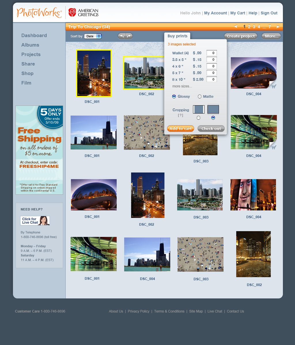
Instead of pairing the same set of tools with every photo, require a selection that enables one global set of tools to affect the entire selection.
- Contextualize help and actions
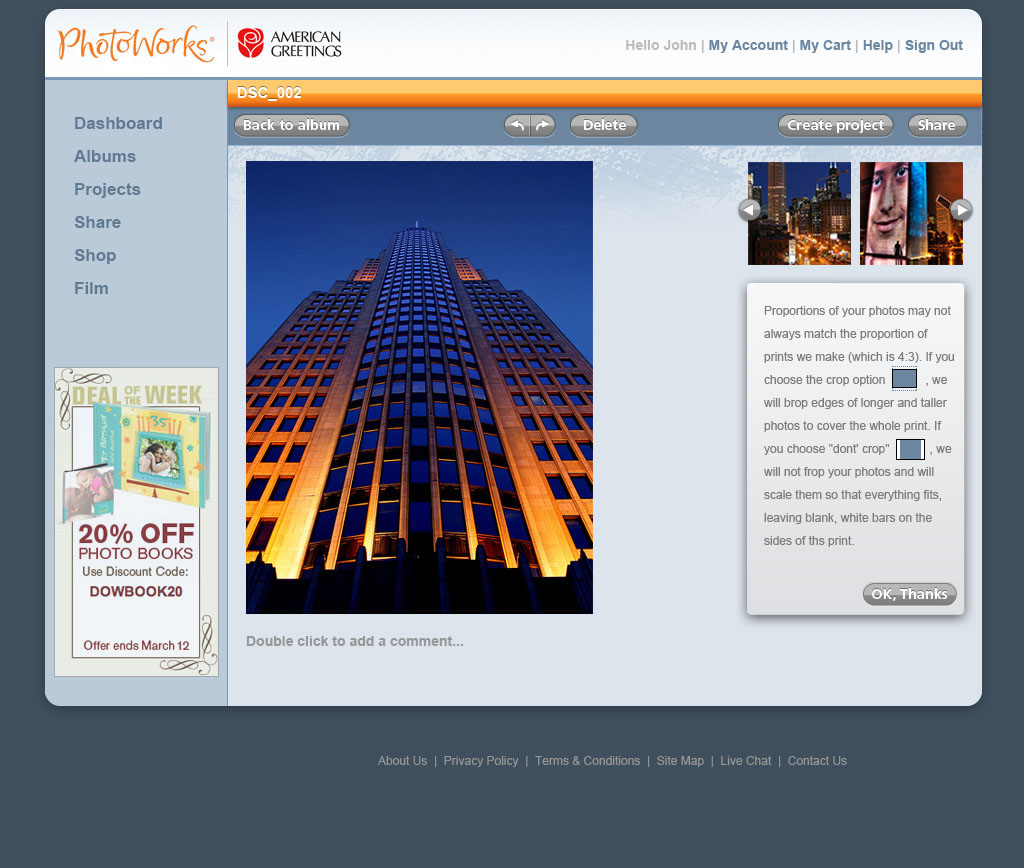
Global help is necessary but not an adequate replacement for specific contextual help offered at critical points.
- Streamline the shopping cart
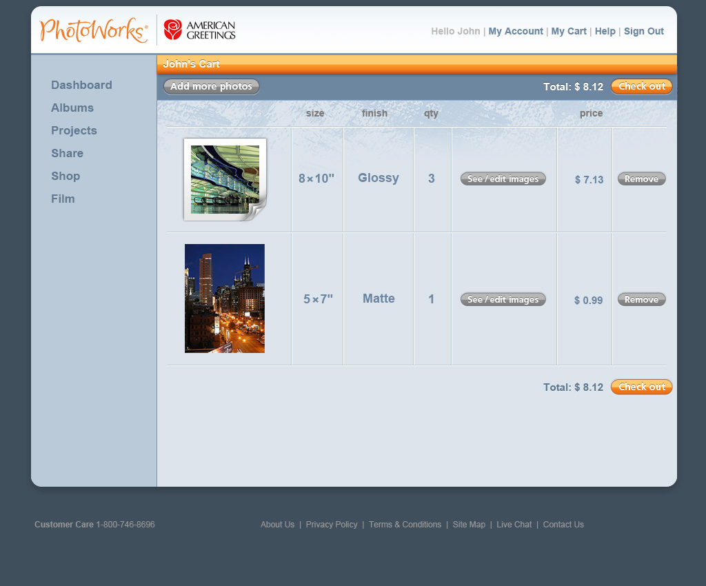
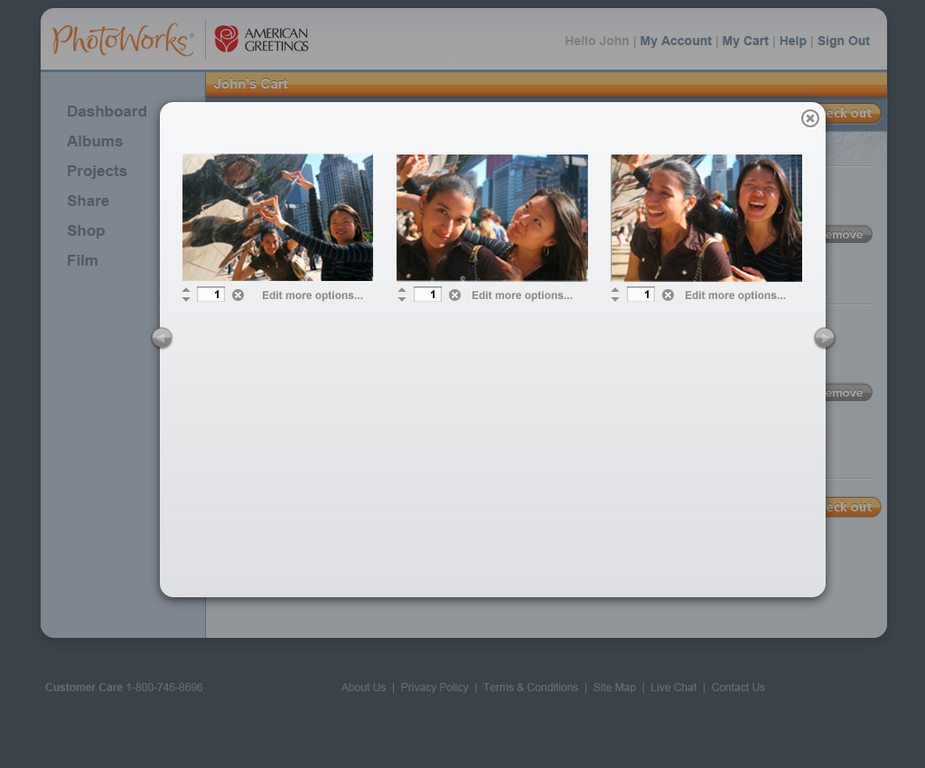
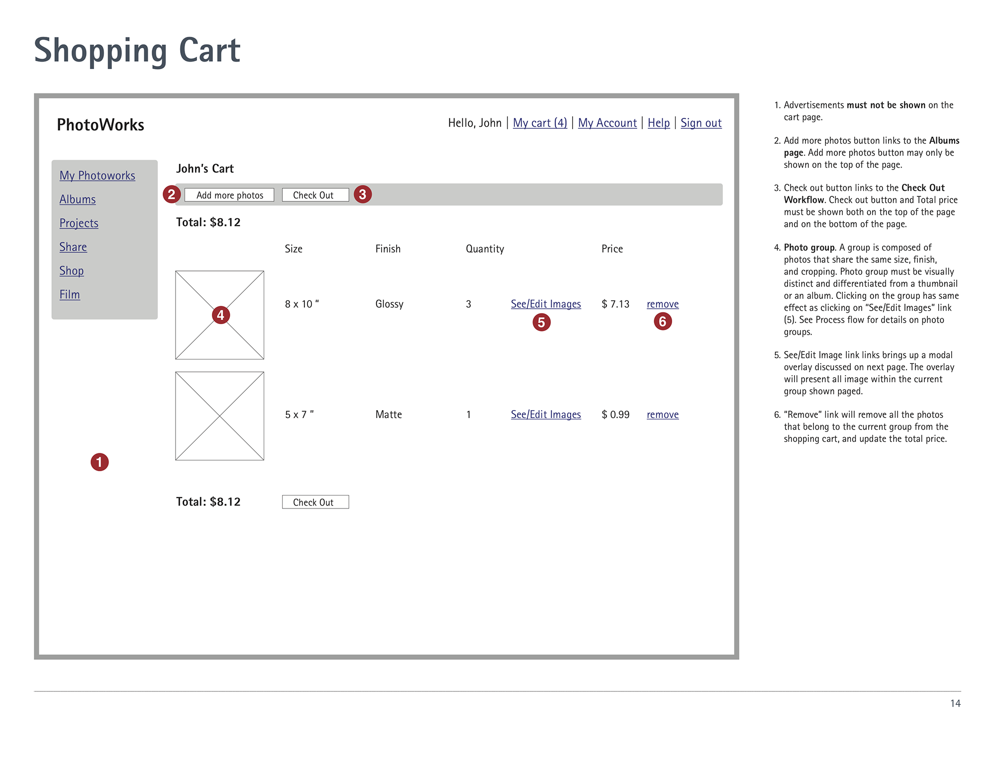
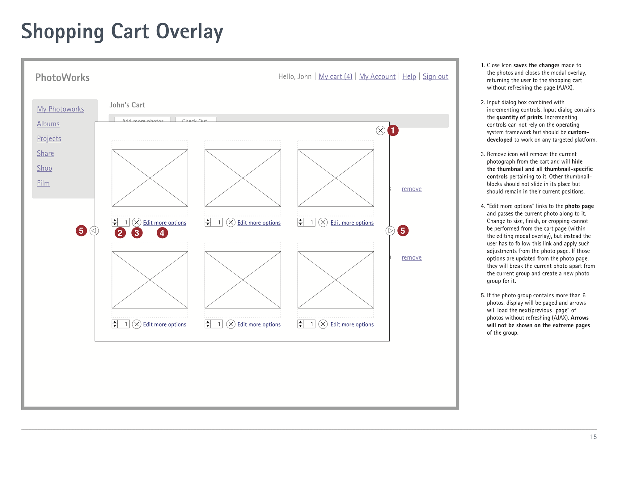
Showing photo groups in place of individual photos for shared sizes and finishes is more informative and saves space.
Putting these recommendations into practice, I tested a paper prototype of my new photo ordering flow with six participants. They tested the prototype at various stages of the design, each feedback providing me with an opportunity to iteratively improve the prototype before the next test (also improving my protocol and my script each time!).
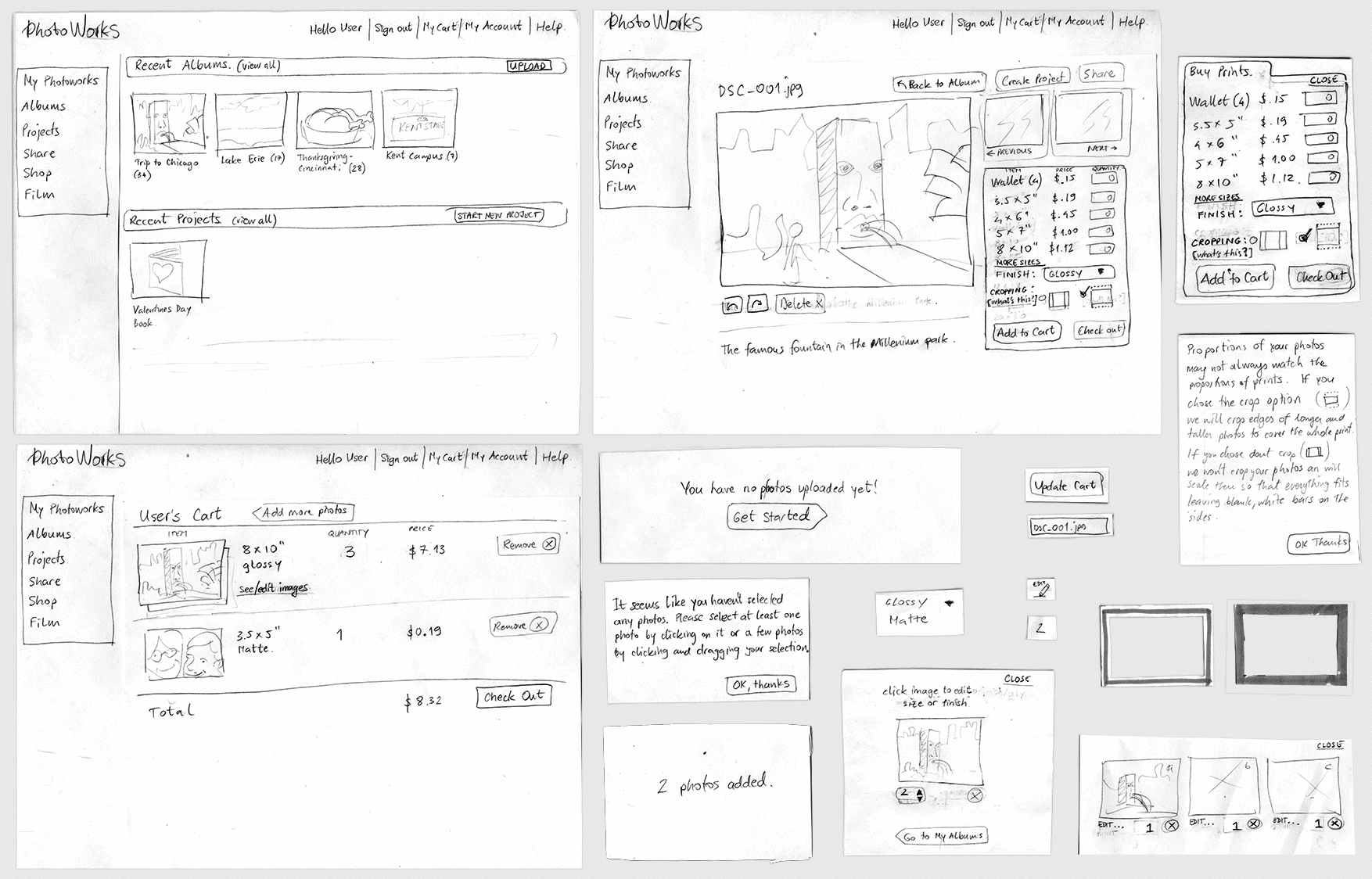
I asked participants to perform these tasks:
- Buy prints of an entire album, 8 × 10", cropped and glossy.
- Buy three 8 × 10" prints of the same photo and one different 4 × 6" print, all glossy, all cropped.
- Alter the order from the shopping cart. Exchange one of the 8 × 10" cropped prints (from the set of three) with an uncropped print of the same size and finish.
What I found was that participants:
- generally did not perceive issues with photo selection and one global set of tools despite the challenge of describing such real-time and modal interaction in this very low-fidelity way.
- were successfull in making simple and complex orders, and were able to modify their orders from within the cart.
- understood the concept of photo groups in the shopping cart.
- all but one referred to help on cropping during ordering, elevating the status of this information to critical.
Design
I had been mapping out and revising the user flow in parallel to conducting usability tests on paper prototypes and the conclusion of testing marked a finalized user flow:
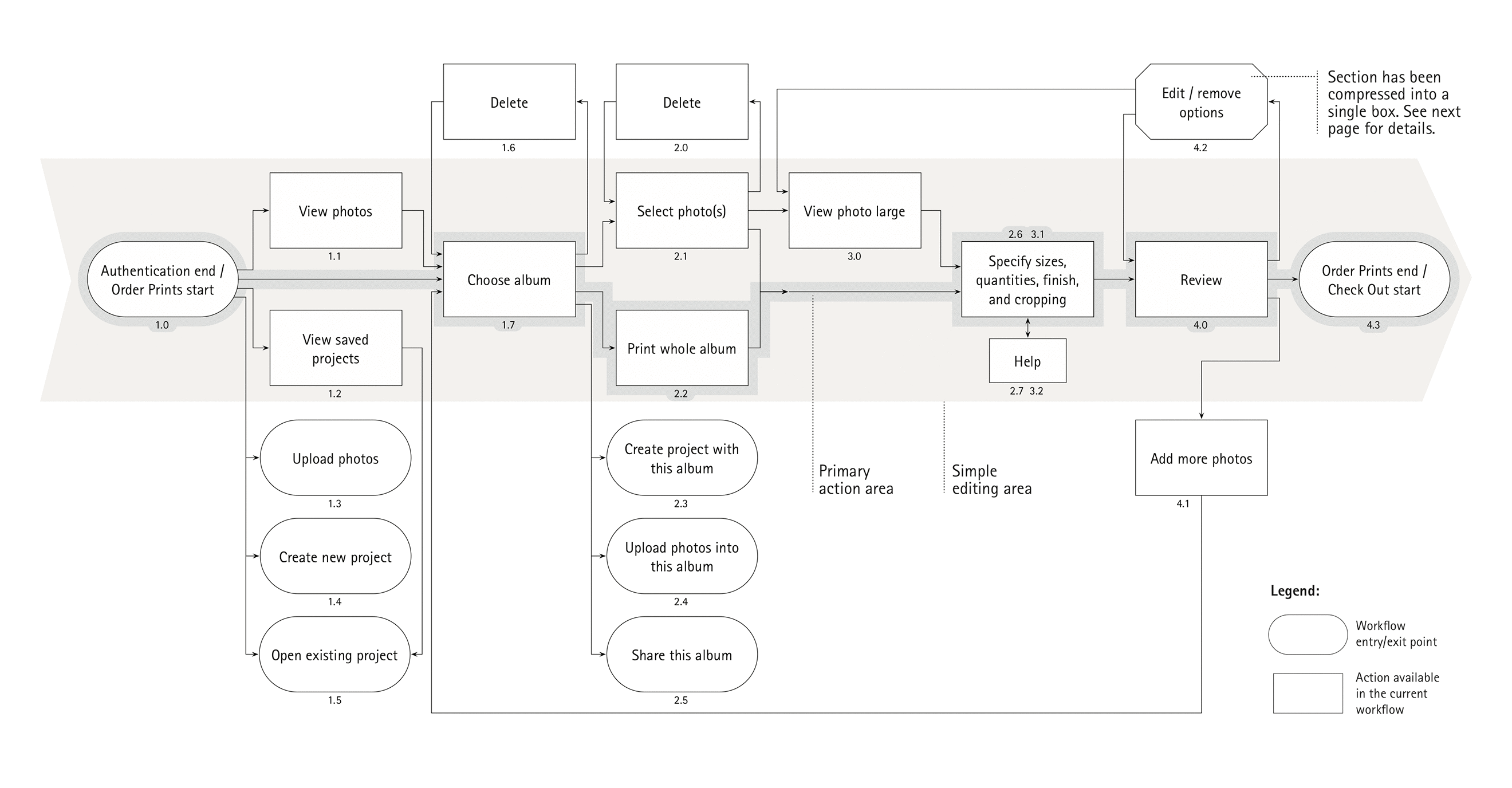
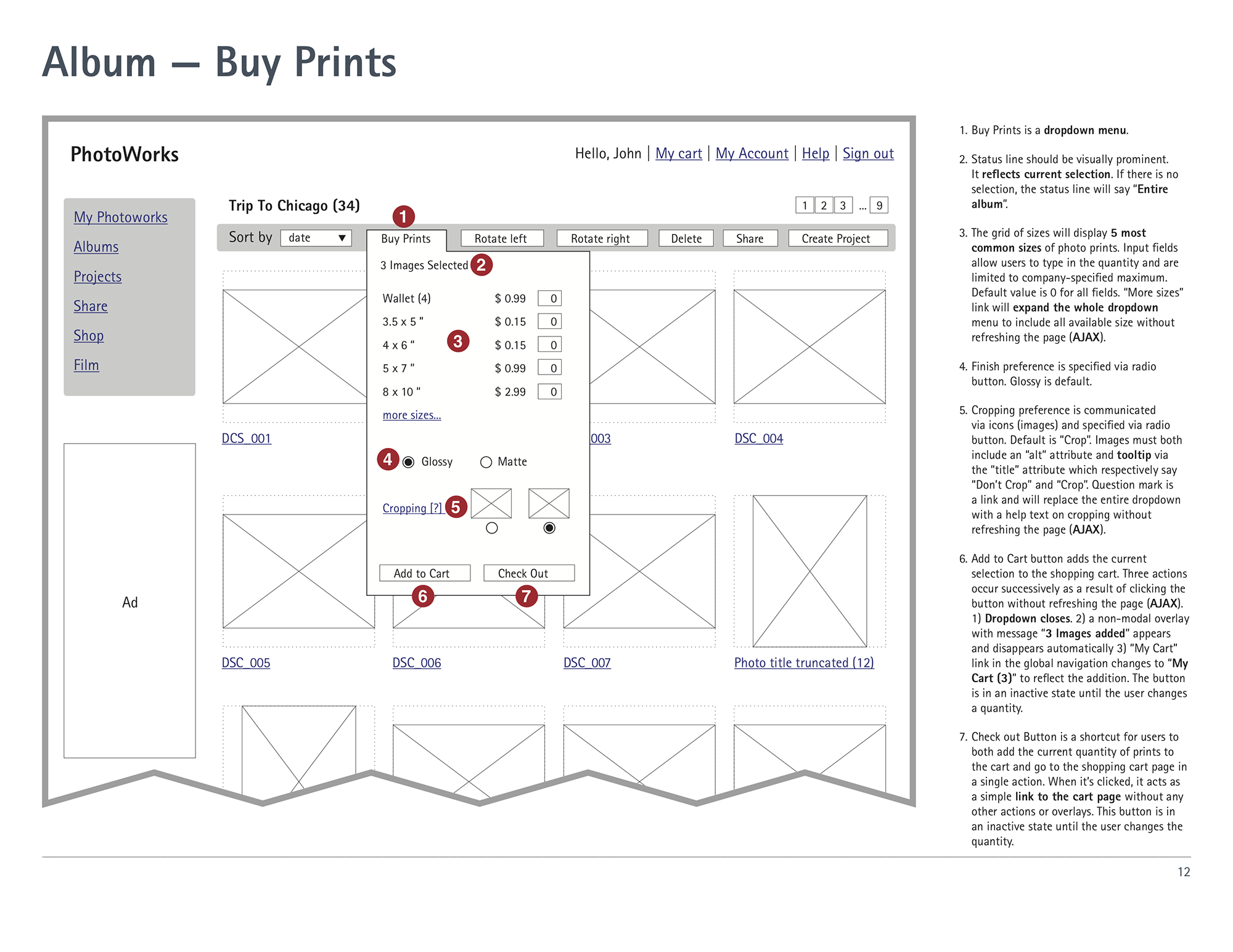
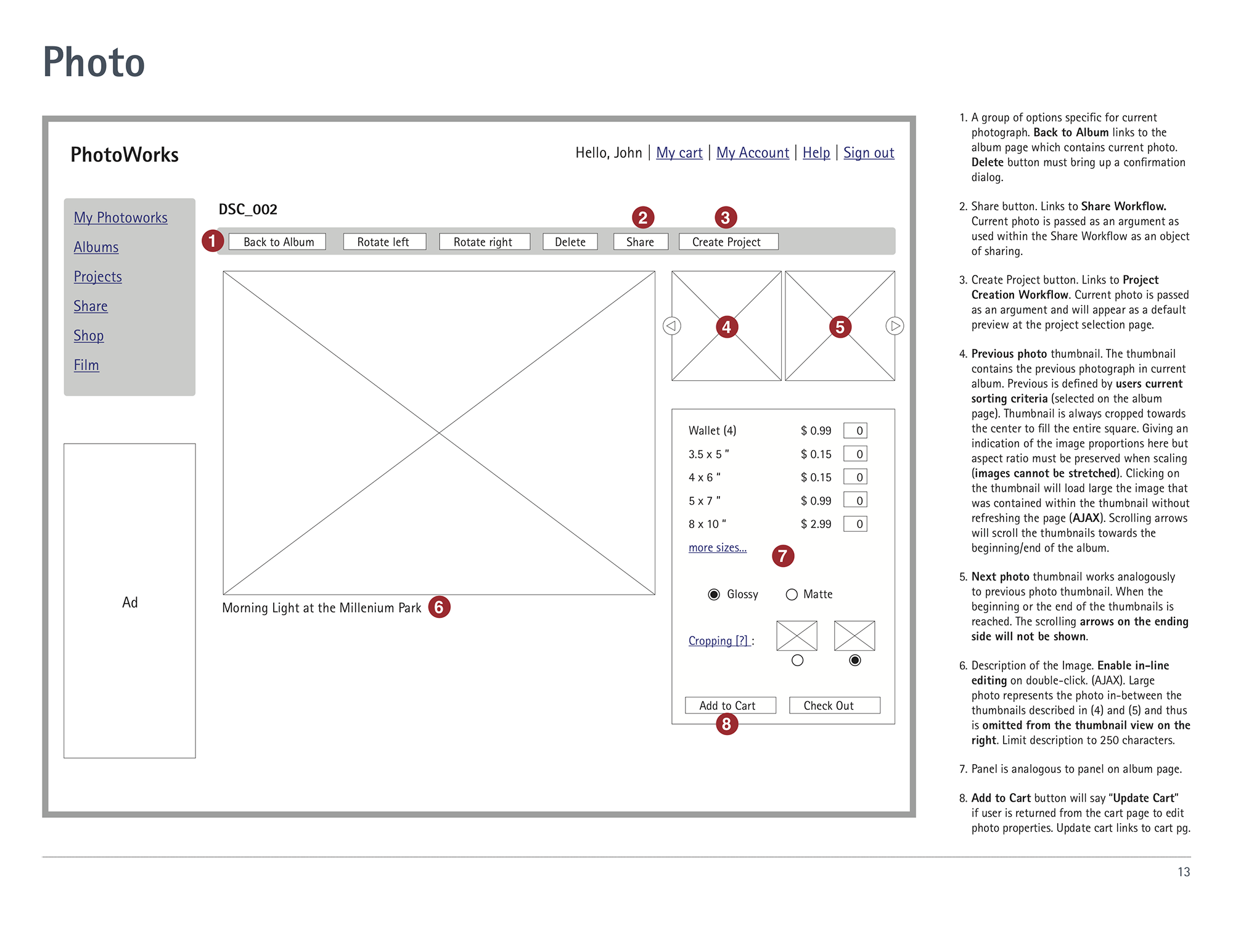
The user flow diagram served as a map for creating a wireframe for each page in the core flow:
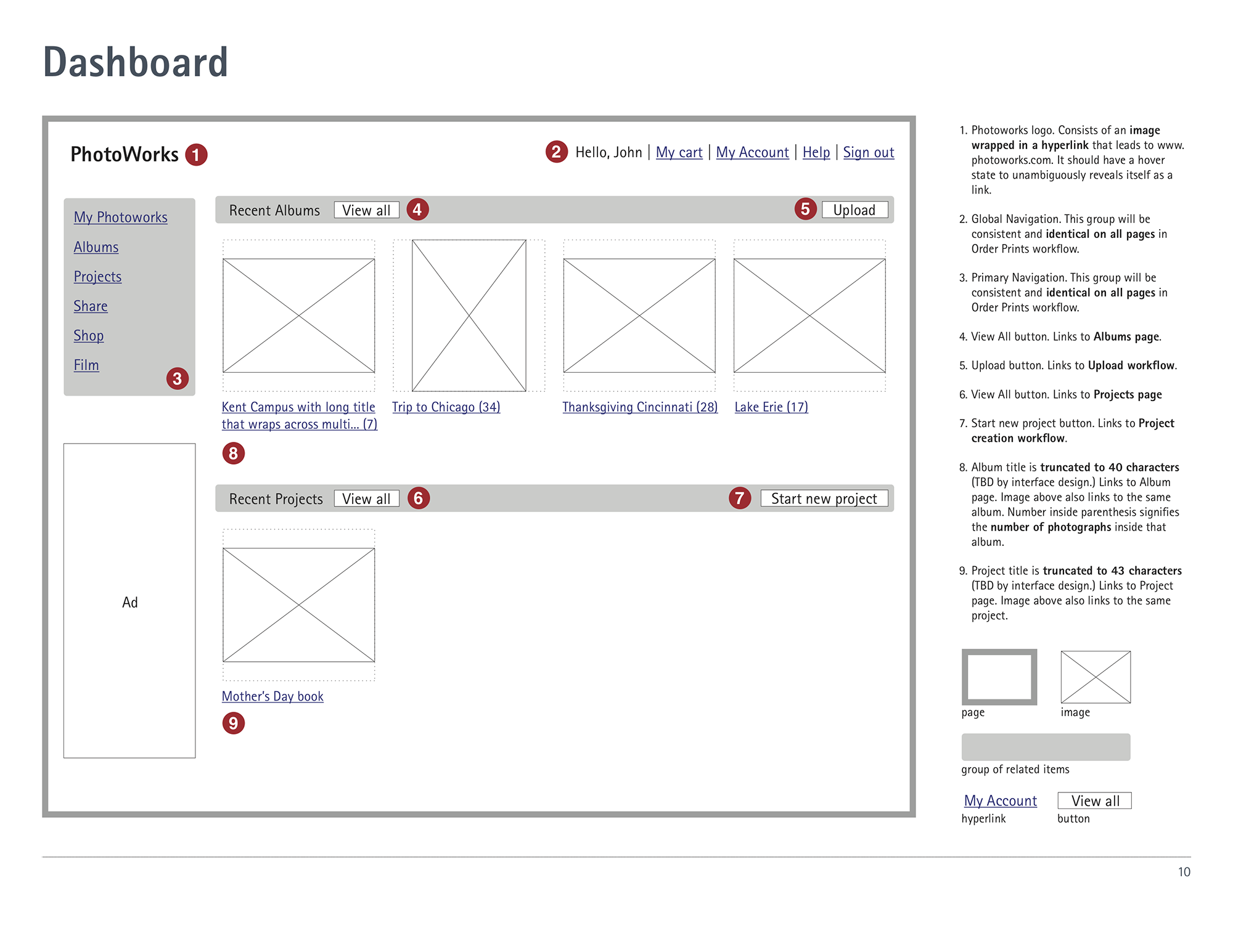
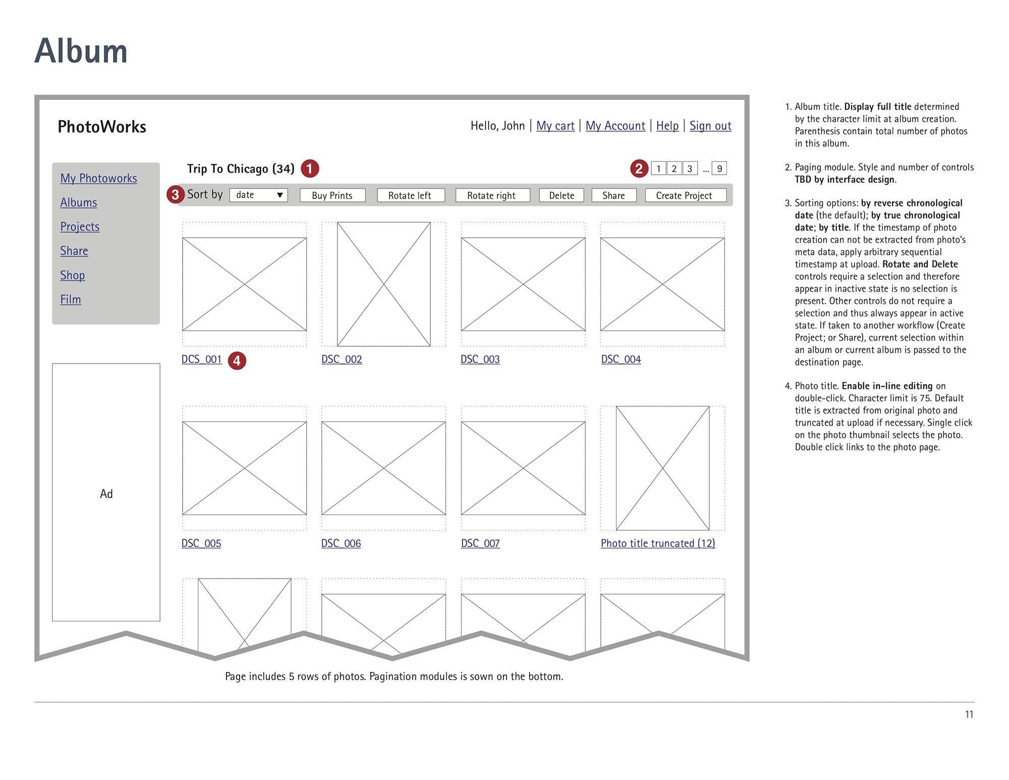
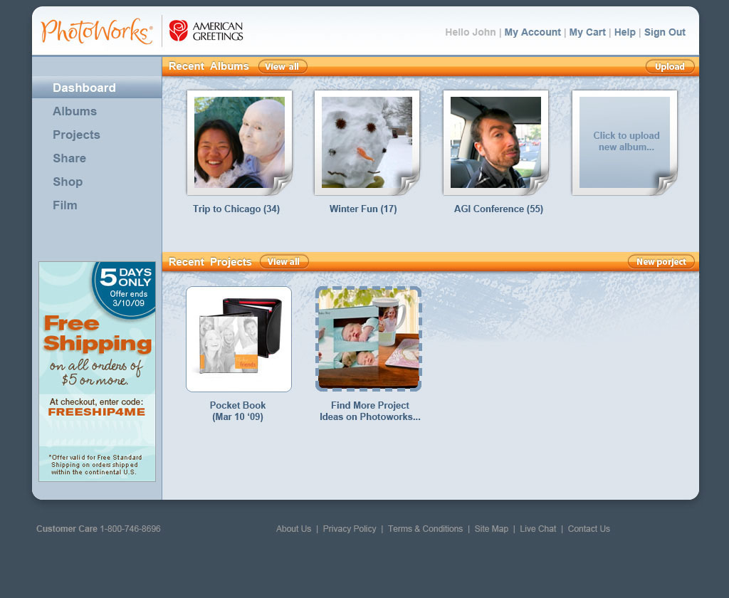
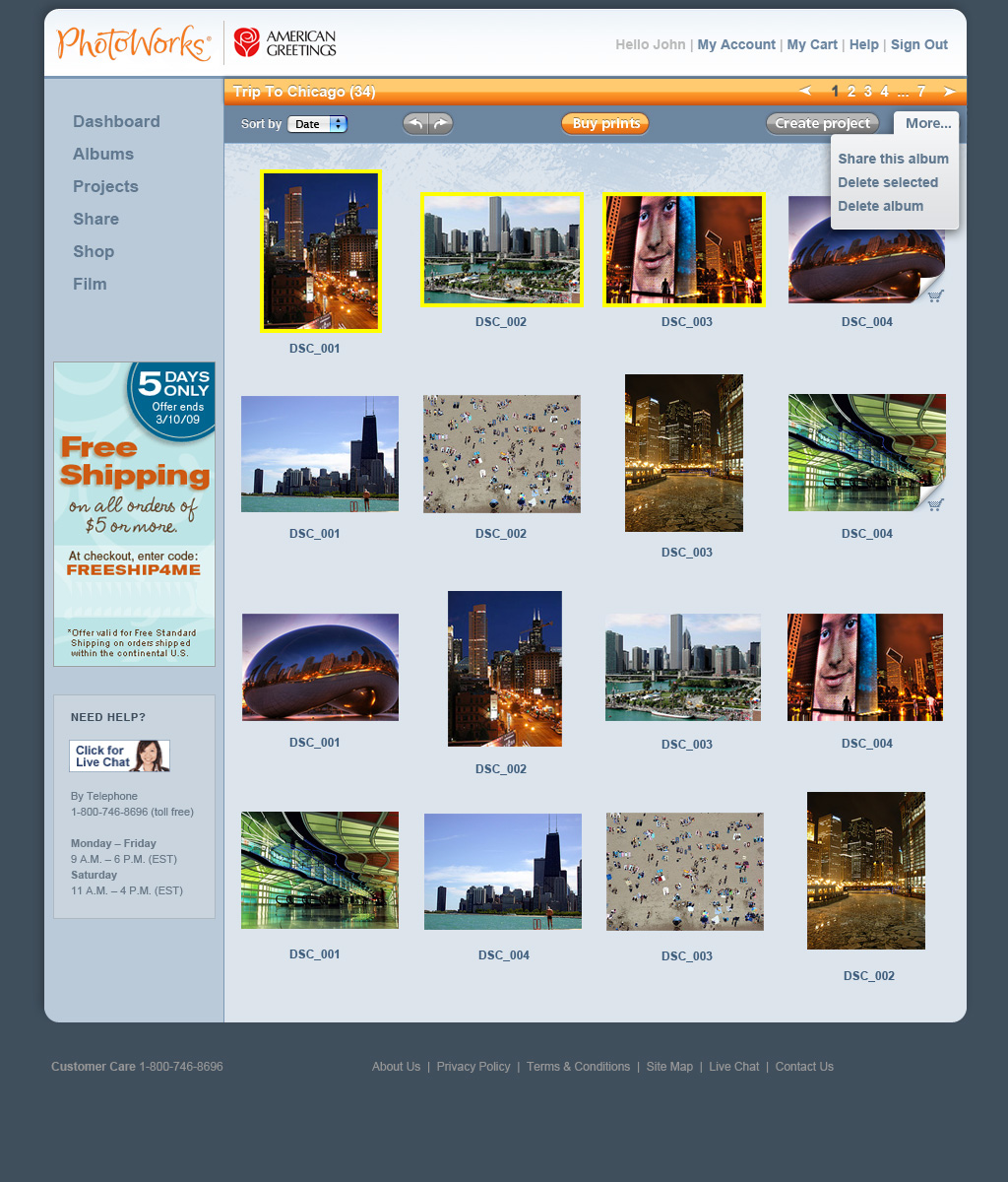
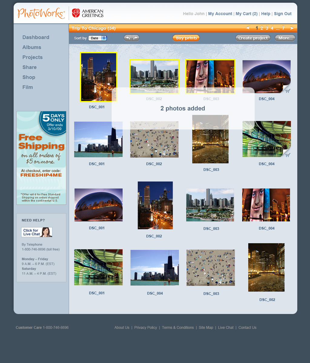
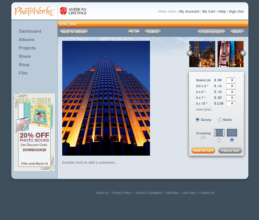
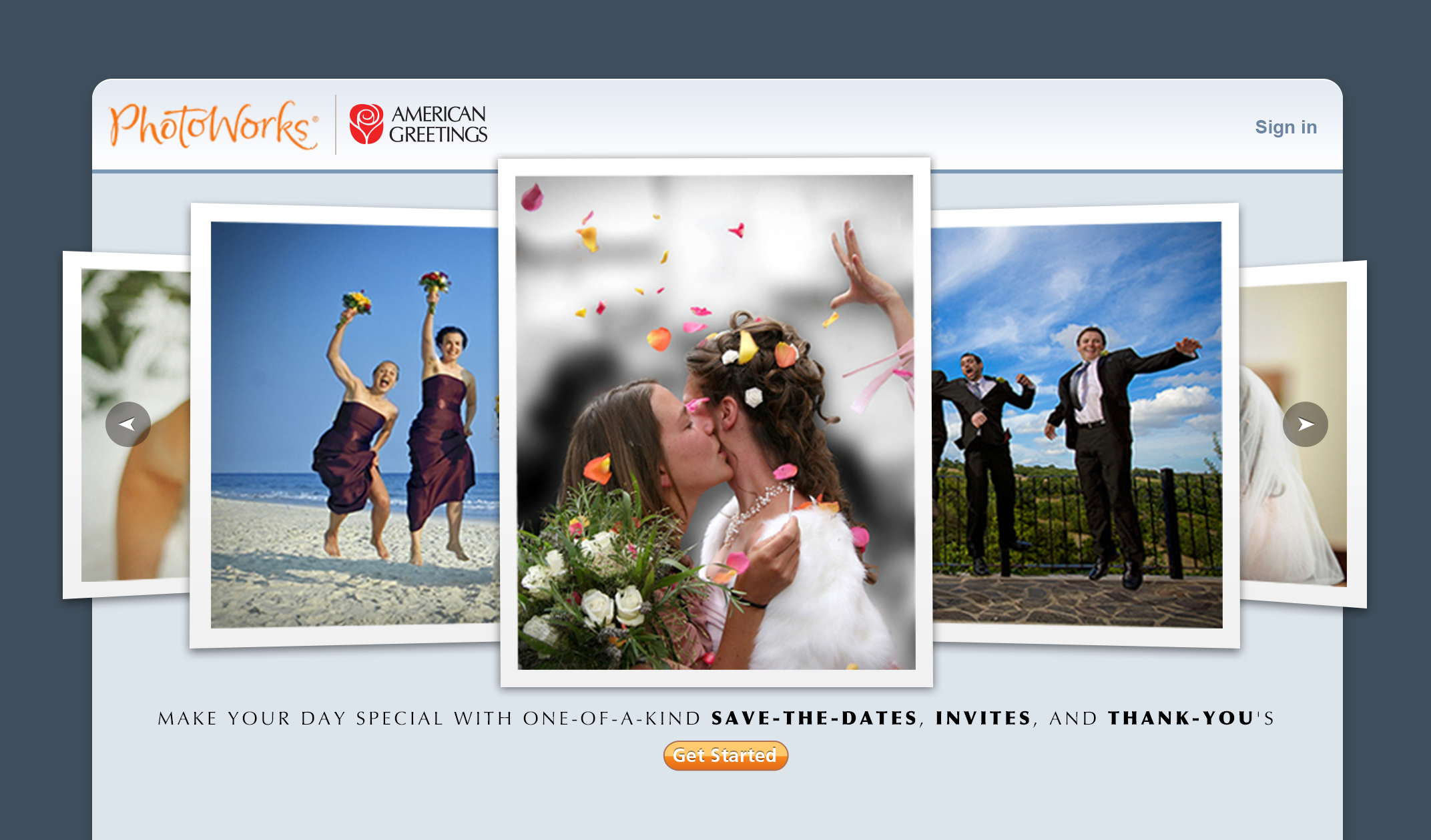
Finally, interface mockups bring the entire flow to life:
