coUrbanize
- Date
- 2019
- Team
- coUrbanize
- Industry
- Civic Tech
- Platforms
- Web
coUrbanize built an online platform that connects communities with commercial real estate developers and city planners. Approvals for new developments involve public meetings. Voices and attitudes in those meetings are particularly unrepresentative of the communities affected. Developers use coUrbanize to supplement the traditional, in-person community engagement with an online platform that makes it more convenient for community members who are not heard from in public meetings to comment on and stay in the loop with the project over time. The platform aspires to drive a more productive, convenient, and ultimately a more democratic and inclusive community engagement process.
When I joined coUrbanize, I quickly shifted focus from improving the flows project teams used to stand up a new project, to more fundamental questions: How successful is our platform at engaging community members who discovered a project and aren’t already familiar with it? The effectiveness of the product depended on engaging members who experience barriers to partaking in public meetings. Though they outnumber the loudest voices, the core product risk was the platform becoming another avenue for amplifying those loudest voices instead of representing more voices.
The product team of 6 had been both attending public meetings in communities close to us and conducting interviews with users of our platform as part of ongoing product research. I noticed a pattern when looking at the data teammates collected. Most respondents seemed deeply invested in the project they followed or very engaged in civic issues in their communities in general. I learned interviewees were recruited non-selectively.
I teamed up with Kate, a product manager to try learning more about those who were less engaged. First, we used Drift’s widget on project pages to pop up a simple screener for visitors and ask those who qualified if they’d be willing to talk with us. I learned that getting in touch with the audience we were interested in was difficult. While we did reach a few, visitors who were more passively interested in a project preferred not to be interviewed even thought they completed screeners at a healthy rate.
Reaching for an alternative source of information, I drove an initiative to deploy a session-recording & playback tool into our project sites to observe visitor’s behavior. The engineers chose Inspectlet after evaluating a few competitors.
Around the time we were struggling with selective recruitment, the CEO told us about a research paper published by Google’s Civic Innovation Team in 2014: Understanding America’s Interested Bystander: A Complicated Relationship with Civic Duty. It validated the behaviors we were seeing, and filled in the picture with attitudes and motivations. It gave us something else too: a label for this user segment, the interested bystander, which we adopted and used side-by-side with our other persona, the usual suspect.
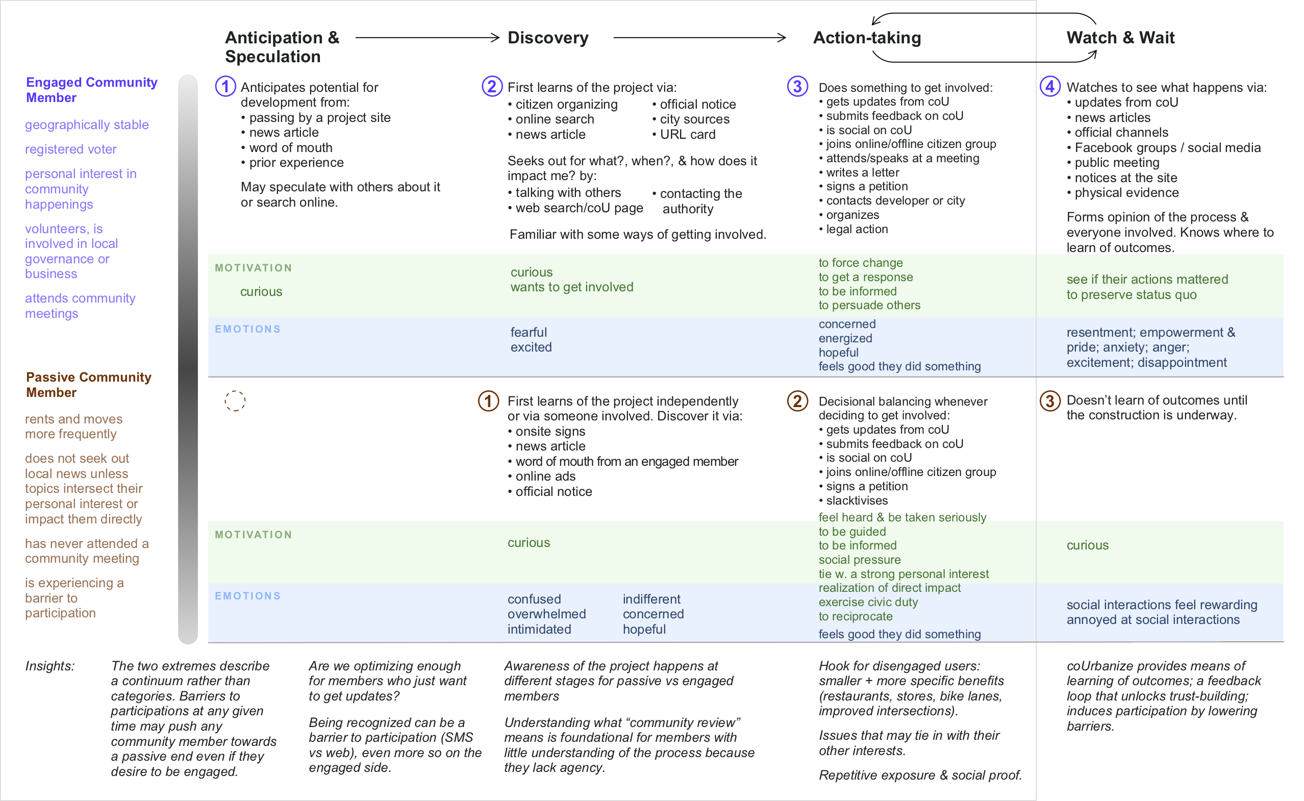
From these multiple primary and secondary research threads, I pieced together a journey map—or rather—two journey maps that illustrated how the experience with a development project of a usual suspect is different form the experience of an interested bystander:
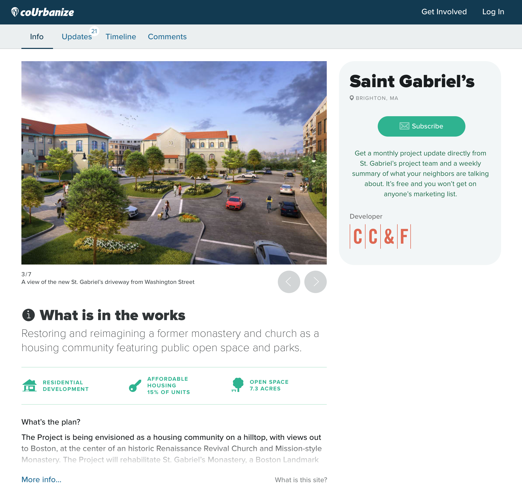
Over the following weeks, I used insights from the journey mapping exercise to shape this set of changes to our public project pages with the aim of boosting the conversion rate among interested bystanders:
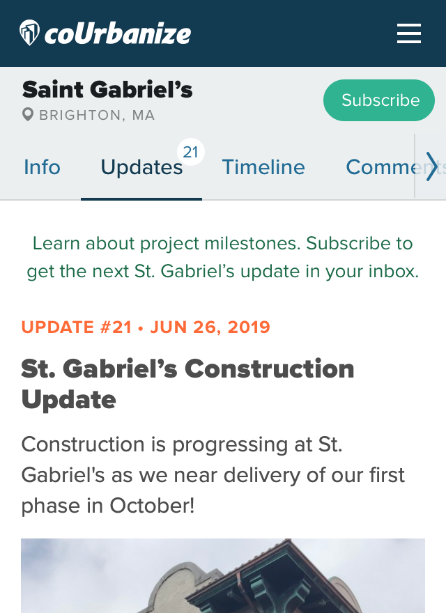
Change call-to-action to “subscribe”
As long as it is obvious that that subscribing is free, it is a lower commitment call-to-action compared to others we used, one that will resonate more with interested bystanders.
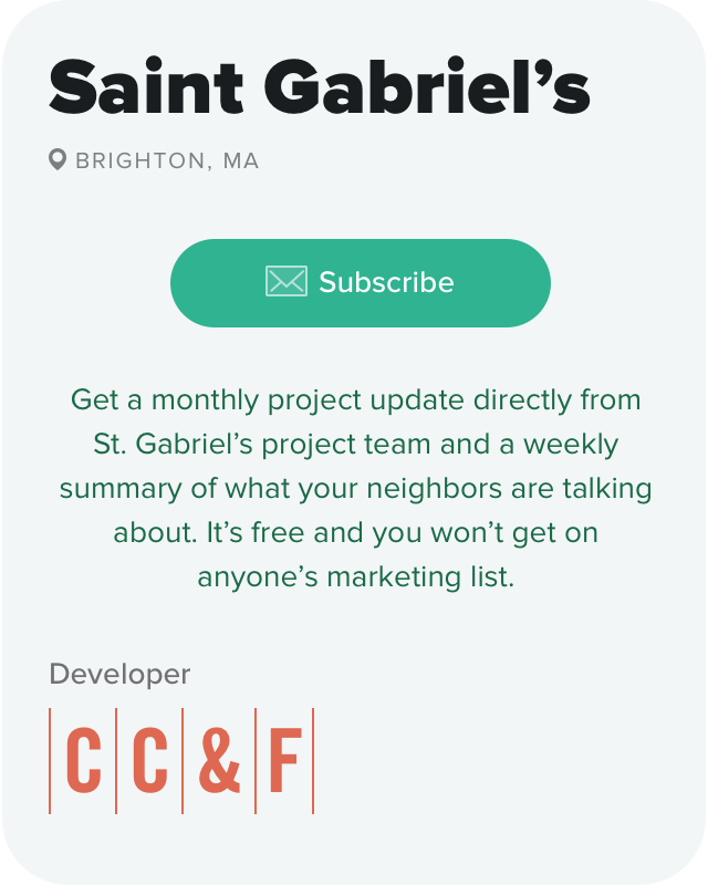
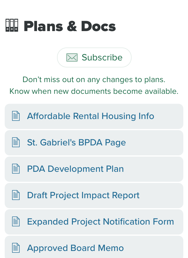
Spell out the value proposition of subscribing
These are specific benefits that an interested bystander can relate to.
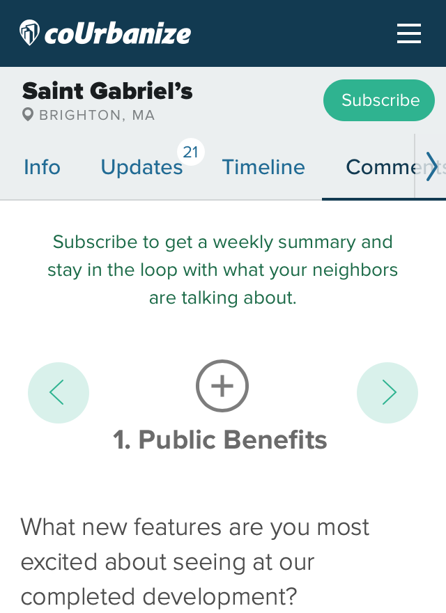
Contextualize value propositions
Each tab or section should have a unique value proposition, one that relates to different motivations.
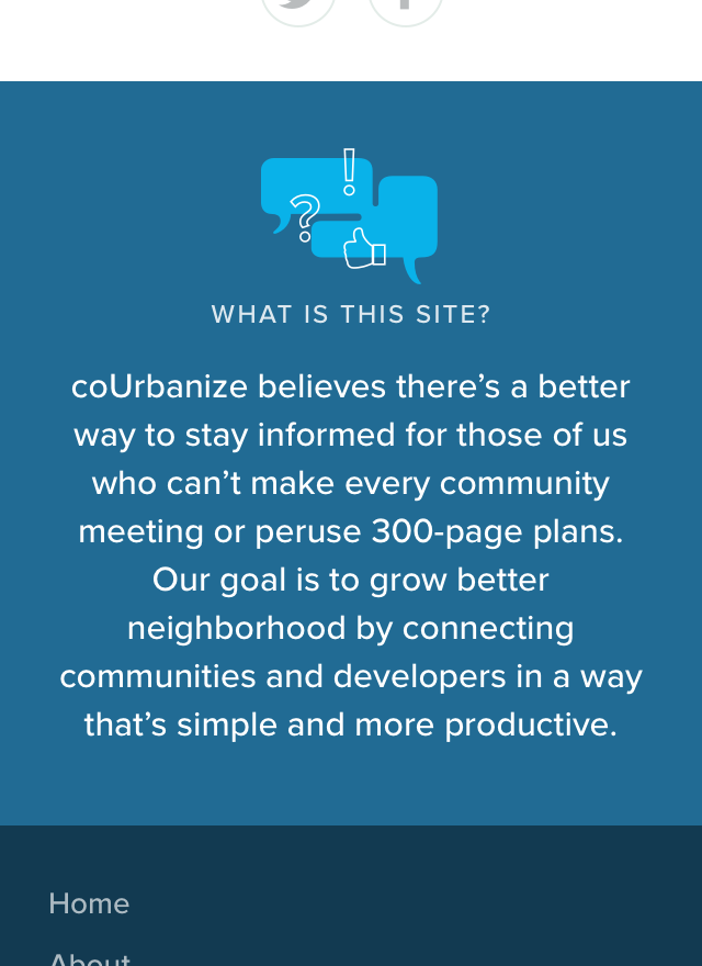
Intentionally position the platform
We are an independent platform for anyone interested in building thriving communities, not to be confused with a developer’s marketing site.

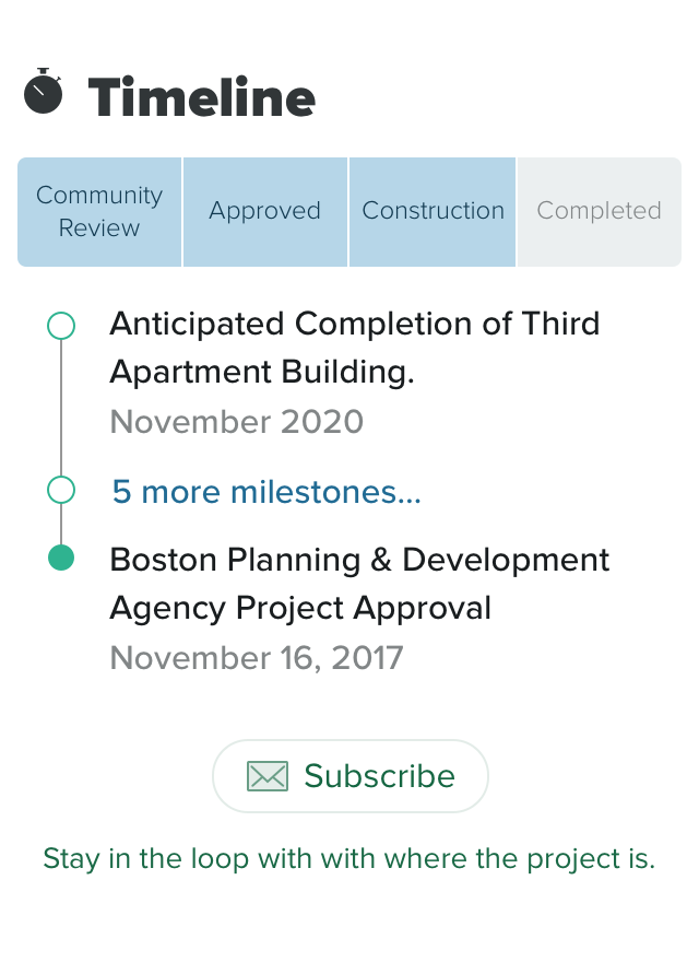
Emphasize dynamic content
Bring in small bits of content from other tabs (Updates, Timeline, Comments) to the default Info tab. Highlighting the living and changing nature of projects sets them apart form static news articles and developer’s advertisements.
When Kate ran an analysis on the impact of those changes between Q2 and Q3 we saw 22% more visitors, 123% more signups by subscribing and 44% more signups overall (visitors could also sign up directly from the commenting flow by commenting, where numbers stayed virtually the same). This gave us multiple chances over time to engage interested bystanders deeper via outbound communications and build a relationship with them. ▨
