Attendance Roster
- Date
- 2010
- Platform
- iOS 4
- Scope
- Product design
As an instructor, I tracked student attendance on paper and found the process of transcribing the attendance data to a digital format entirely cumbersome. Yet, I could not find a suitable way to track attendance digitally.
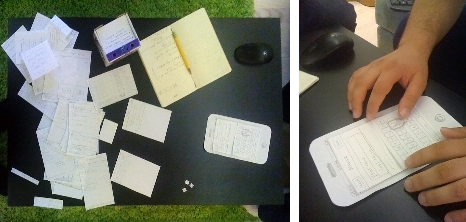
I developed a product concept to fulfill my own need but I aimed for the app to be useful to anyone needing to keep group attendance. I started as usual, by iterating through a paper prototype on my own, then testing it with colleagues. Below is the resulting design documentation that details my design intent.
A friend of mine who was looking to sharpen his Andriod development chops, used this design documentation to develop a minimum viable prototype of Attendance Roster for Android. It featured only the core, attendance keeping view (no reminders or splitting into groups features) and he ended up implementing two versions of the app. The free, feature-limited version gained over 8,000 device installs from the Google Play store in just over three years without any significant promotion effort or advertising. The paid version gained over 800 purchases also involving no promotion or ads. I did not expect the variety of use cases we encountered through support requests and Play store reviews. It was rewarding to see the app used by music instructors and members of the clergy, to name two examples, among many high school teachers.
Purpose
Attendance Roster application for iOS (the app) allows primarily university instructors to keep track of their students’ attendance. The app enhances an instructor’s in-class performance by automatically reminding instructors of significant attendance-related events. For example, a student reaching maximum allowed number of absences, etc.
The app also facilitates the process of starting an in-class discussion or a critique by allowing a student to be picked at random and facilitates the process of splitting a class into small groups.
While the app is targeted to university instructors, it may be useful to anyone needing to keep track of group attendance.
Conceptual Model

A class of students is a primary construct in the app. Each of the classes entered into the app can be seen in the Roster view (the primary view), Reminders view, and Random view. The app registers its settings in Apple’s Settings application, rather than within the app since the settings such as date format, or automatic reminders will usually be set once and changed infrequently.
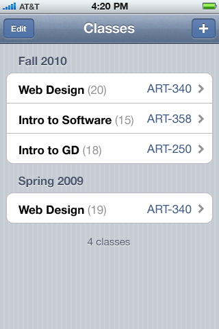
Because a class of students is a primary construct of the Roster app, a new user must enter at least one class and at least one student related to that class to use the app. After multiple classes are entered, the default view shown to a user upon opening the app is the Classes view.
The exception to this default Classes view occurs when the app is opened during a time that falls within a specific class period stored in the app. In that case, the initial view shown is the Roster view of the class taking place at that specific time.
The maximum number of classes supported by the app is 500. Classes are automatically sorted by semesters into fall, spring, and summer. The number of students enrolled in each class is shown in parenthesis.
Class entry workflow
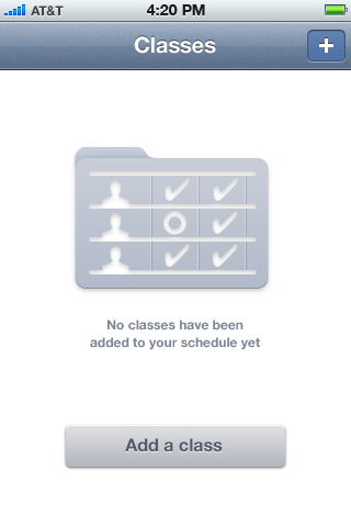
Before any classes are entered, the app opens into an empty Classes view shown above. Note the absence of the “Edit” button on the top bar on this empty view.
Tapping on “Add a class” or “+” buttons from the initial Classes screen leads to the New Class screen.
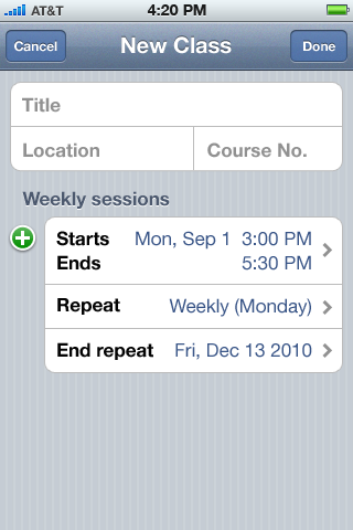
The New Class screen starts the class entry workflow.
Title of the class is limited to 50 characters. Location is limited to 30 characters. Course Number is limited to 8 characters.
Weekly sessions can be thought of as a calendar event. Entering weekly sessions is very similar to entering events in Apple’s Calendar app. The internal representation of class session times should be in standard iCal format or should be easily interoperable with an iCal format since future versions may import class sessions from and export to iCal.
The default time shown in the “Starts” box is the current time. The default “Ends” time is set to two hours and thirty minutes from the current time.
The default Repeat setting is set to repeat weekly The default “End repeat” setting is set to 15 weeks from current time. Maximum repeat length is set to 18 weeks.
Tapping on the start, end, and repeat settings provides the default Cocoa date control. Tapping on the repeat setting leads to Repeat Event screen.
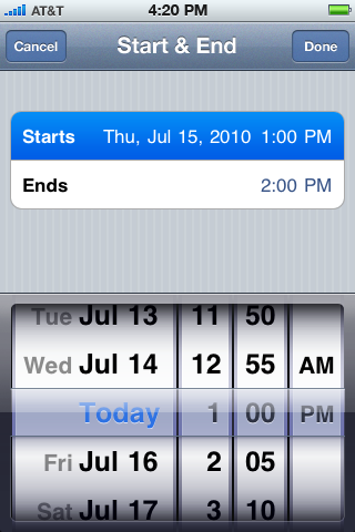
Start & End times entry are identical to Apple’s Calendar app event entry.
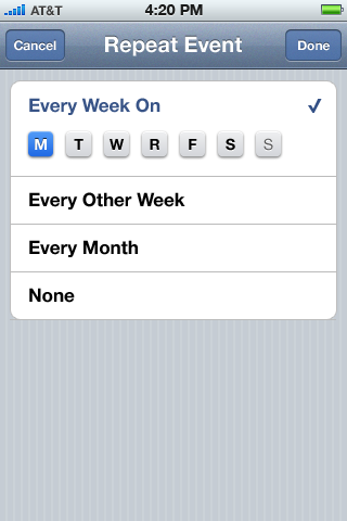
Repeat Event setting is set to repeat weekly by default. The default frequency is once weekly set to a day on which the class session starts.
Buttons for each day below the weekly repeat allow for a faster entry of a regularly repeating class. For example, it’s fairly common for a college class to take place at the same time on Mondays, Wednesdays, and Fridays. By tapping on “W’ and “F” buttons on the left, users can finish entering a class in one step, rather than entering multiple sessions by tapping on the “+” button from the New Class screen. For examples in practice, see the event entry workflow with the repeat settings in Google Calendar.
Allowing the multiple sessions to be entered in the New Class screen is still a necessity since the app should be able to accommodate a schedule when instruction takes place at 2 PM on Mondays and Wednesdays but 4 PM on Fridays.
Upon selecting any option other than “Every Week On,” its row will collapse while day buttons fade out. One day button must always stay highlighted, while “Every Week” is checked.

When adding additional classes, the class times are not allowed to overlap with the class times of any of the existing classes. The check is performed upon tapping the “Done” button, and time overlaps are communicated via Cocoa Touch’s standard alert. The text of the alert reads:
This class overlaps with {{name of the first overlapping class}}. Revise the class time to avoid time conflicts.
The button text is set to “OK”
When adding multiple sessions (e.g., for irregularly repeating class), sessions are not allowed to overlap one another. If the session overlap occurs, alert is also shown:
Multiple class sessions are overlapping. Revise the session times to avoid time conflicts.
The default start-time of an additional session is set to the end-time of the previous session. Session conflicts checks are only performed upon tapping the “Done” button.
The “Done” button remains inactive until at least one character has been entered into the class title field.
The label of the “Repeat” item is set to the Full name of the day for sessions that repeat once a week. For sessions that repeat between twice and three times a week, the label is set to the medium name of the day. For sessions that repeat between four and six times a week, the label is set to the short name of the day. For sessions that repeat on all seven days of the week, the label is set to “Every day”. For sessions that repeat on five work days, the label is set to “Weekdays.” For sessions that repeat on weekends, the label is set to “Weekends.”
To summarize all cases:
- “Weekly (Monday)”, “Monday, Wednesday”
- “Mon, Wed, Fri”
- “M, T, W, R”, “M, T, W, R, S, S”
- “Weekends”, “Weekdays”
- “Every day”
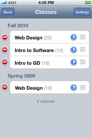
Tapping on the “Edit” button allow for deletion and re-arrangement of classes on the list. When in editing mode, the “+” button changes to “Settings” button which serves as a shortcut to app’s settings.
It is only possible to re-arrange classes within a semester and not between semesters. By default classes are added with latest-added class on top.
When deleting a class with any number of students added to it, an alert is shown with title “Delete a Class?” and text “All {{numberofstudents}} students in this class will be permanently deleted too.” with two buttons labeled “Cancel” and “Delete.”
Student Entry Workflow
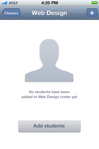
Before any students have been added to the roster of an existing class, the empty Roster view is shown after selecting a class.
Note the absence of the tab bar in this view.
Tapping on the “+” button in the navigation bar or the “Add students” button begins the student entry workflow which consists of only one screen.
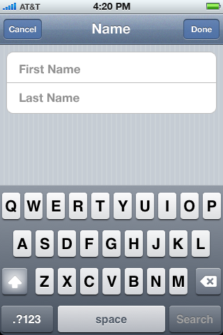
The Name Entry view features only two standard Cocoa Touch input fields.
The First name and last name fields are each limited to 35 characters.
Tapping the “Done” button concludes the workflow and takes users to the Roster view of the current class.
It is not possible to enter a student with a blank first and last name, and “Done” button remains inactive until at least one character has been entered for one of the names.
A future version of the app might possibly have a search field which would allow for a fast entry of previously entered students (e.g., in another class) with their related information.
Roster View
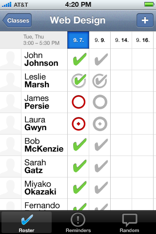
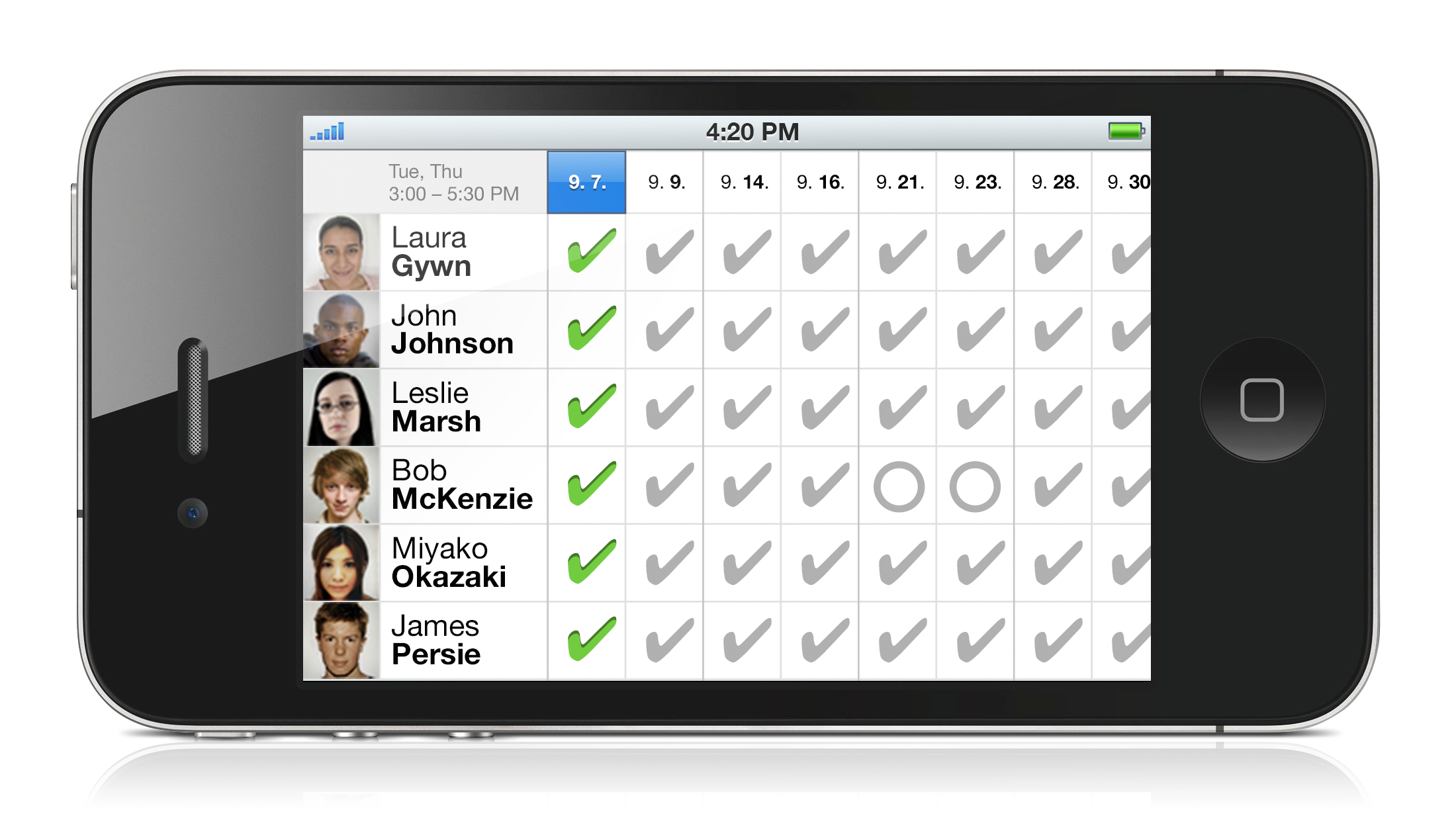
Once the first student is entered, the roster view of the current class is shown. The three tabs: Roster, Reminders, and Random appear across the bottom of the screen.
Student names are arranged alphabetically either by first or last name, according the preference chosen in the settings, the default being by last name.
Dates for the entire length of the class are automatically laid out across the top in the format specified in the device’s “International” preference in the general settings.
For classes with a repeat setting set, the time area on the top left shows the same repeat label discussed under the Class Entry workflow if the class is entered from a single session or a combined label if the class is entered in multiple sessions. If the class is entered in multiple sessions, then the second line is not shown. If it’s entered in one session, then the start and end-times of the session are shown in the second line.
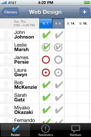
There are four attendance symbols in the app:
- Checkmark signifies presence.
- Checkmark within a circle signifies partial presence (e.g., late arrival or early departure).
- Plain circle signifies an unexcused absence.
- Circle wit a dot signifies an excused absence.
When tapping on a cell, the symbols change from a blank cell to one another in the sequence specified above.
If the application is opened during the class period, it will open in the Roster view of the currently class. A class currently taking place is signified by a recessed date.
Only one date (one class period) is available for editing at a time to prevent inadvertent inputs. The editable date is signified by a blue background and its related column in shown in color, as opposed all other columns, which are shown in gray.
If the application is opened during the class period, current (recessed) date is editable (blue). Else, all columns are gray after the initial load.
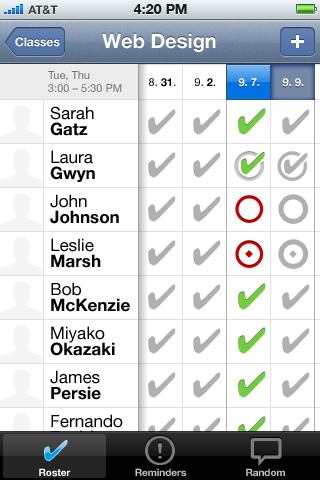
When a date is tapped, it becomes available for editing (blue) and it’s related column shown in color. This method of interaction is identical to Apple’s Calendar app.
Dragging the cells between the dates row and the names column will scroll the table both horizontally and vertically. When scrolling horizontally, the names remain fixed and the shadow appears to the right of the names column, unless the first date of the class is visible, in which case no shadow appears. The effect is similar to the shadow that appears around cells in Apple’s tables application. While scrolling, the cells must snap to the edges.
When opening the application during a class period, first date of the class is shown first and 0.3s later, the table is scrolled with easing until the current date positions itself to the first place. The effect is similar to the automatic scrolling shown upon page load at www.apple.com/mac/
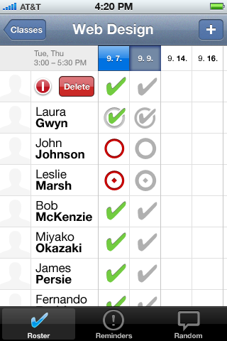
Note that any kind of “Edit button” is absent from the navigation bar in this view. It is not possible to rearrange the order in which names of the students are shown.
Students are deleted from the list by swiping right from a student thumbnail. Since this is a non-obvious operation, upon adding a very first student, an alert is shown with instruction:
To delete students, swipe right across their name or thumbnail
The button text on this alert should be set to “Thanks.”
The width of the names column should never be narrower than 90 pts. to accommodate the deleting controls.
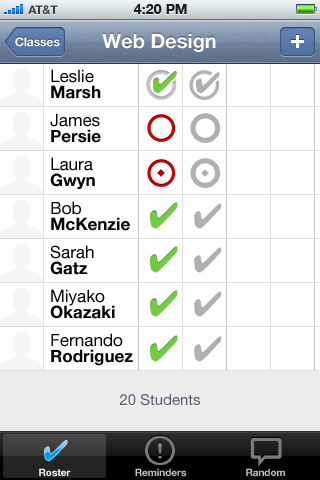
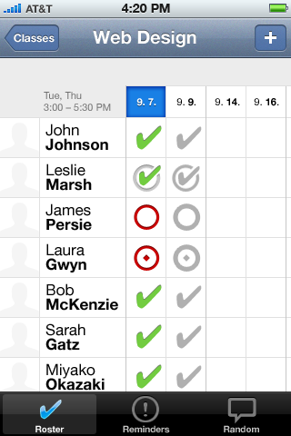
Scrolling to the bottom of the list shows the total number of students in the class that stays centered regardless of the scrolling status of the table. Scrolling to all: top, bottom, and right edges exhibits the standard Cocoa Touch elastic behavior when reaching the end of a list.
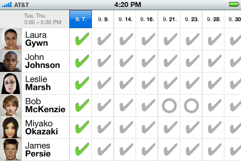
Roster tab is the only view in the app that supports the landscape view. It maximizes the viewable area of the app by omitting all the tabs, navigation bar, and status bar. The landscape view otherwise behaves identically to the portrait view.
When tapping on the student thumbnail, the photo-taking workflow is invoked. This workflow is identical to the photo-taking workflow inside the Apple’s Contacts app.
Maximum and minimum width are defined for the names column. Within that range, the names column width is set to the width that accommodates the widest name in the class. At maximum width, long names are ellipsized in both landscape and portrait orientation. For most names, first 11 characters should be visible in landscape orientation before the ellipsis (8 characters in portrait).
Reminders
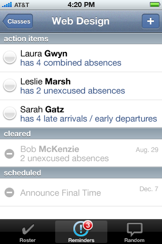
The purpose fo the Reminders tab is to inform of significant attendance-related events. It automatically reminds users of three events:
- A student reaching a maximum number of combined (excused and unexcused) absences
- A student reaching a maximum number of unexcused absences
- A student reaching a maximum number of partial attendances.
Actions items are always displayed in this order with custom reminders appearing on top.
The maximum number of allowed absences by default is set to be equal to number of weekly class session. Both the maximum number of combined absences and the maximum number of partial presences by default are set to twice the number of weekly class sessions.
Tapping the button next to an item under the “action items” heading causes it to collapse & fade-out of that section and expand & fade-in inside the “cleared” section with a checkmark.
Cleared items are shown in reverse chronological order of when they were cleared (checked off). Clearing date is shown to the right of each item. Clearing items cannot be reversed. Only cleared and scheduled items can be deleted directly.
Reminders tab bar item is badged with a standard Cocoa Touch badge that displays the number of pending action items. If there is no pending items, the badge is not shown.
Within a group of action items of the same kind (e.g., unexcused absences) items are sorted chronologically with newest items appearing the lowest in the group.
The number of automatic reminders is not directly limited. The number of custom reminders for a class is limited to 50.
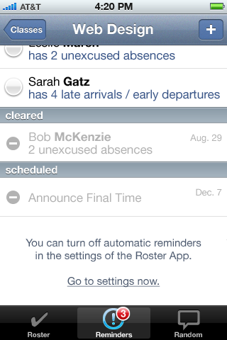
Automatic reminders can be turned off in the app’s settings. The help text along with a shortcut to app’s settings is always displayed on the bottom of the Reminders view.
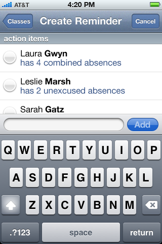
The Reminders view also serves as a to-do list, allowing the entry of custom reminders. Custom reminders can be entered by tapping on the “+” button in the navigation bar.
Custom reminders consist of the reminder text (limited to 35 characters) and date when the reminder should come up in action items.
Upon successful addition, and before it is mature, custom reminders are shown in the “scheduled” section along with a date of maturity.
Scheduled reminders are shown in chronological order of maturity starting with soonest-maturing.
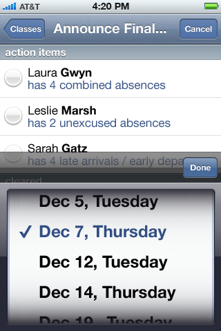
Creating reminders is a two-step process, which begins by typing the reminder text, and finishes by selecting the class session during which the reminder should appear. The selection is made from a controlled list of all class sessions for the current class from present time onward.
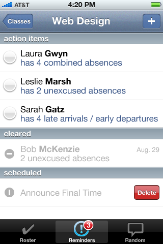
Deleting a scheduled reminder or a cleared reminder follows Cocoa Touch’s standard interaction for deleting list items. It is not possible to delete automatic reminders or mature custom reminders directly.
If there are no reminders in any one of the three groups, the heading for that group is omitted.
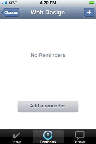
Empty state of the reminders tab.
Random
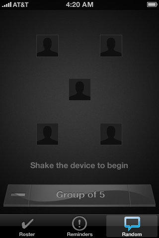
The Random tab facilitates the process of starting an in-class discussion or a critique by suggesting a random student. It can be useful for learning student names as well. The random tab can also be used to split a class of students into small groups with the maximum of five members.
When random tab is tapped, the Random view is displayed in its initial state. The initial state shows only placeholder images and a line of instructions. Every time the Random tab is opened, it shows the initial state. Whether the initial state is for a single student, a group of five, or anything in between is remembered from the last use. The very first time that Random tab is opened, it shoes the initial state for single student.
The Random tab remains inactive until at least two students have been added to the roster.
In the Random tab, the status bar is displayed in opaque black version.
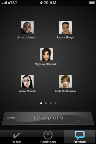
Shake the device to choose a student at random or a random group of students. The names, photos, and pagination controls fade in on each shake. Pagination is in the forms of dots behaving identically to the iOS home screen controls. Shaking the device again generates new groups or a different random student.
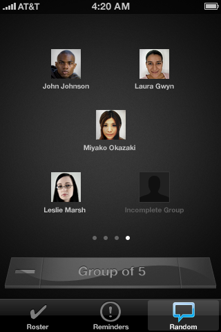
Sliding horizontally here shows the subsequent random student or the subsequent group until the end of the class is reached.
For groups with a number of members which cannot be divided evenly, the remainder (the last group) is filled with a placeholder image titled “Incomplete Group”
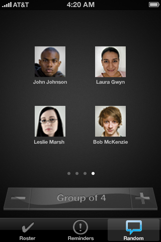
Tapping the “+” or “−” buttons when available changes the number of group members and the accompanying title in the dock-like glass. Titles are:
- Single Student
- Pairs
- Group of 3
- Group of 4
- Group of 5
The transition between states is animated. As a thumbnail is added or removed, the rest re-arrange themselves into a new order. Thumbnails also get larger the fewer of them there are.
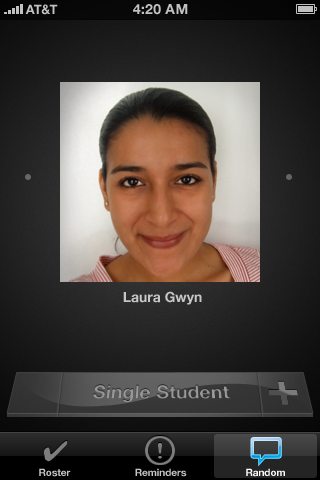
A single student random view displays a large image and slightly larger name compared to groups.
Whenever a class numbers 17 students or when it is sufficiently large that the number of groups the class is being divided into exceeds 17, pagination dots are omitted from the bottom due to the lack of space. Instead, only the indicator dots are displayed at the left and right edges of the screen. The indicator dots are not displayed at either of the extremes of the range (e.g., no left dot at the beginning and no right dot at the end).
The device can be re-shaken at any time. The app will then generate a new string of random students or groups.
Settings
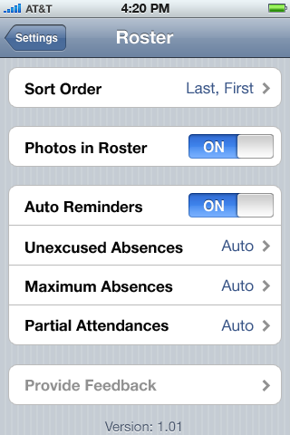
Roster app registers its setting in the Apple’s Settings app.
Sort order options are:
- Last, First
- First, Last
For iPod Touch and iPad, Photos in Roster option is turned off by default. User can turn it on but when engaged in the photo addition workflow, the “Take Photo” option is either not shown, i.e., only “Choose Photo” option is shown.
When Auto Reminders option is off, all three: Unexcused Absences; Maximum Absences; and Partial Attendances options become inactive.
“Give feedback to the developer” button takes the user to the default mail application and composes an email to “feedback@{{TBD}}.com” with subject line: “Roster App feedback from {{firstname}} {{lastname}}.”
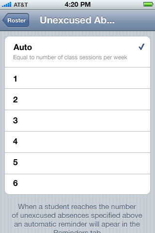
The Auto setting on unexcused absences is the number of class sessions per week.
The Auto setting on maximum absences is twice the number of class sessions per week.
The Auto setting on partial attendances is twice the number of class sessions per week.
Manual Unexcused Absences and Maximum Absences setting ranges from 1 to 6.
Manual Partial Attendances setting ranges from 1 to 8. The help text on partial attendances reads: “Late arrivals and early departures are considered partial attendances.”
App icon on default home screen.
