aptihealth
- Date
- 2022–2024
- Team
- aptihealth
- Industry
- Healthcare
- Platforms
- Web, iOS, Android
aptihealth provides fast, easy access to high-quality mental healthcare for ages 5+. Patients connect with therapists via video sessions and have access to prescribers, case managers, and peer support specialists when needed.

I helped boost provider satisfaction; improved accessibility and access for patients; and made the design and discovery stages of the product development process more agile.
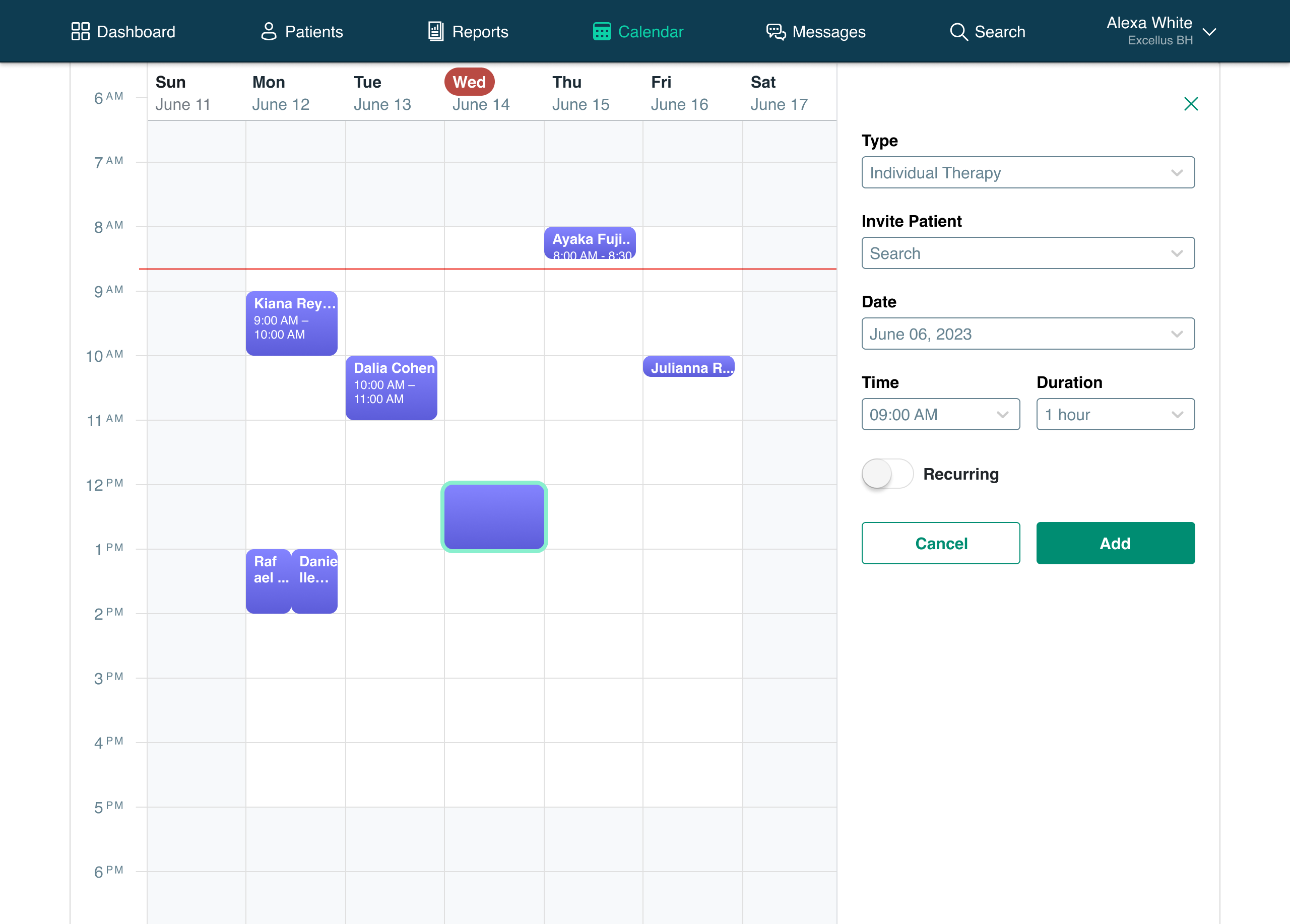
My biggest impact was improving efficiency for providers through changes to the calendar and scheduling features, resulting in a 50-point increase in provider NPS for scheduling. Through supervisor interviews, user support, and backlog review, I discovered that providers experienced several pain points while using the calendar, which was a home base for their work every day:
- No weekly view
Viewing one day at a time made it difficult to optimize one’s schedule. It was frustrating to navigate and hindered proactive engagement with patients with upcoming appointments. - No working hours
While they needed to be set in providers’ profiles, working hours were not visible on the calendar, sometimes leading to mistakenly scheduled 2AM appointments.
- Error prone entry
Scheduling new events was done on a separate page from the calendar view, increasing the potential for scheduling conflicts. - Inadequate availability control
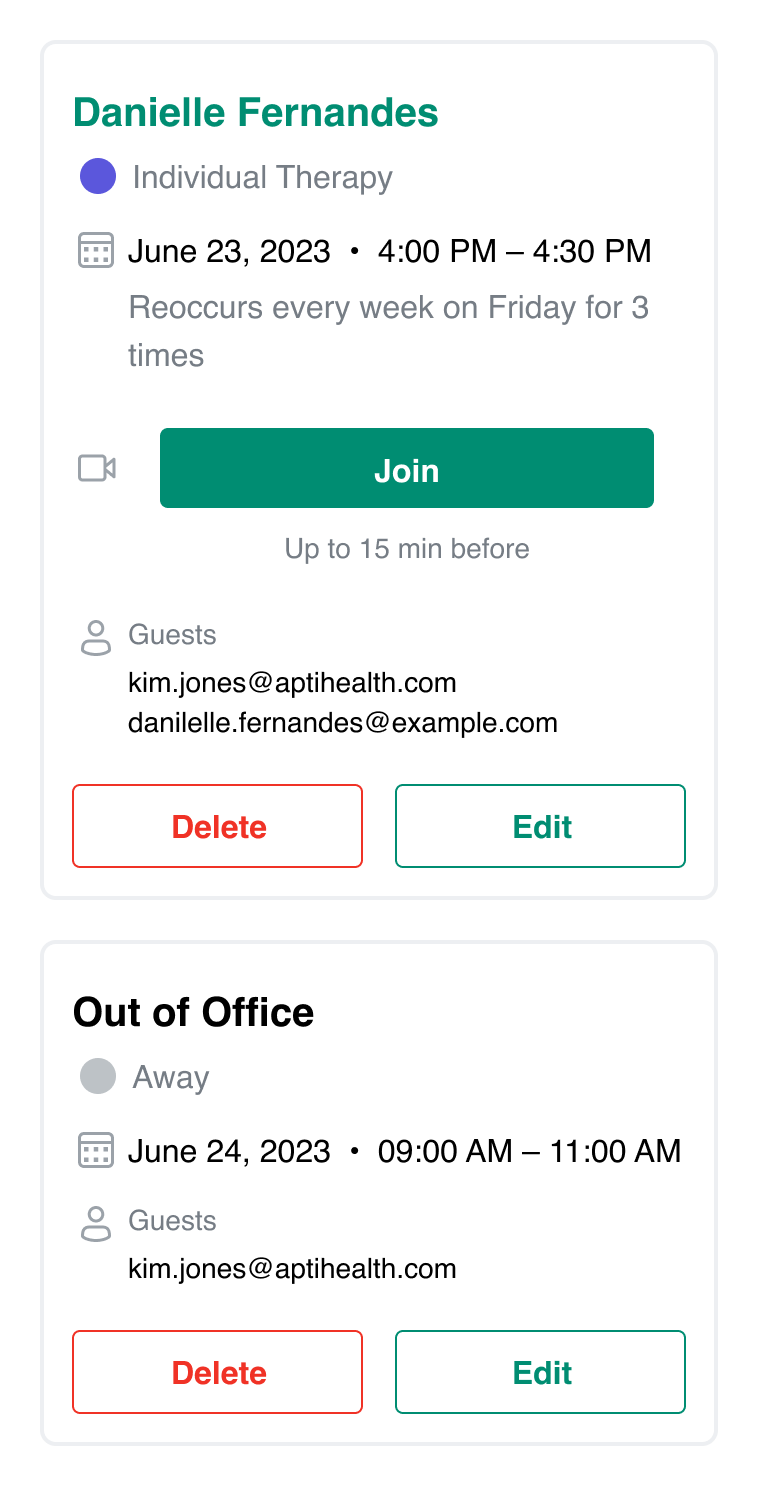
There was no way to block off just one slot on the calendar nor to create ad hoc availability during non-working hours. Changing profile settings to meet this widespread need created as many problems as it solved.
I introduced the weekly calendar view, which became the new default. Navigating and optimizing one’s schedule became easier.
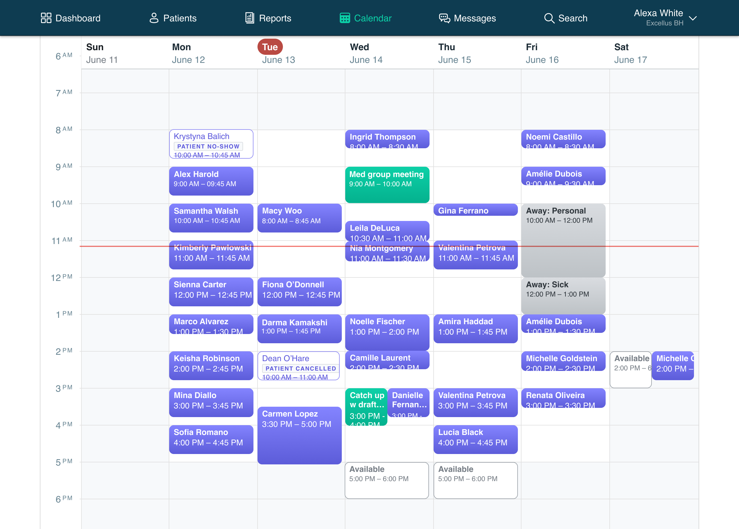
The new drawer maintained the calendar context when inputting or editing event details, reducing errors. Grayed out blocks indicated non-working hours. New event types for Away, Admin, and Available were embraced immediately. And small, quality-of-life improvements like the running “time now” indicator further boosted provider confidence in the tool.
Design System
I spearheaded the adoption of Storybook for managing front-end components, drove migration to Figma to allow me to create a half-dozen shared component libraries, and audited components to create a tighter coupling between code and design assets, which streamlined communication with engineers and improved design efficiency. While new colors and new icon set got used the most, the content style guide I introduced also became an important part of the design system.

Intake Coordinator
Primary Care Provider
Peer Support Specialist
Behavioral Health Specialist
Prescriber
Case Manager
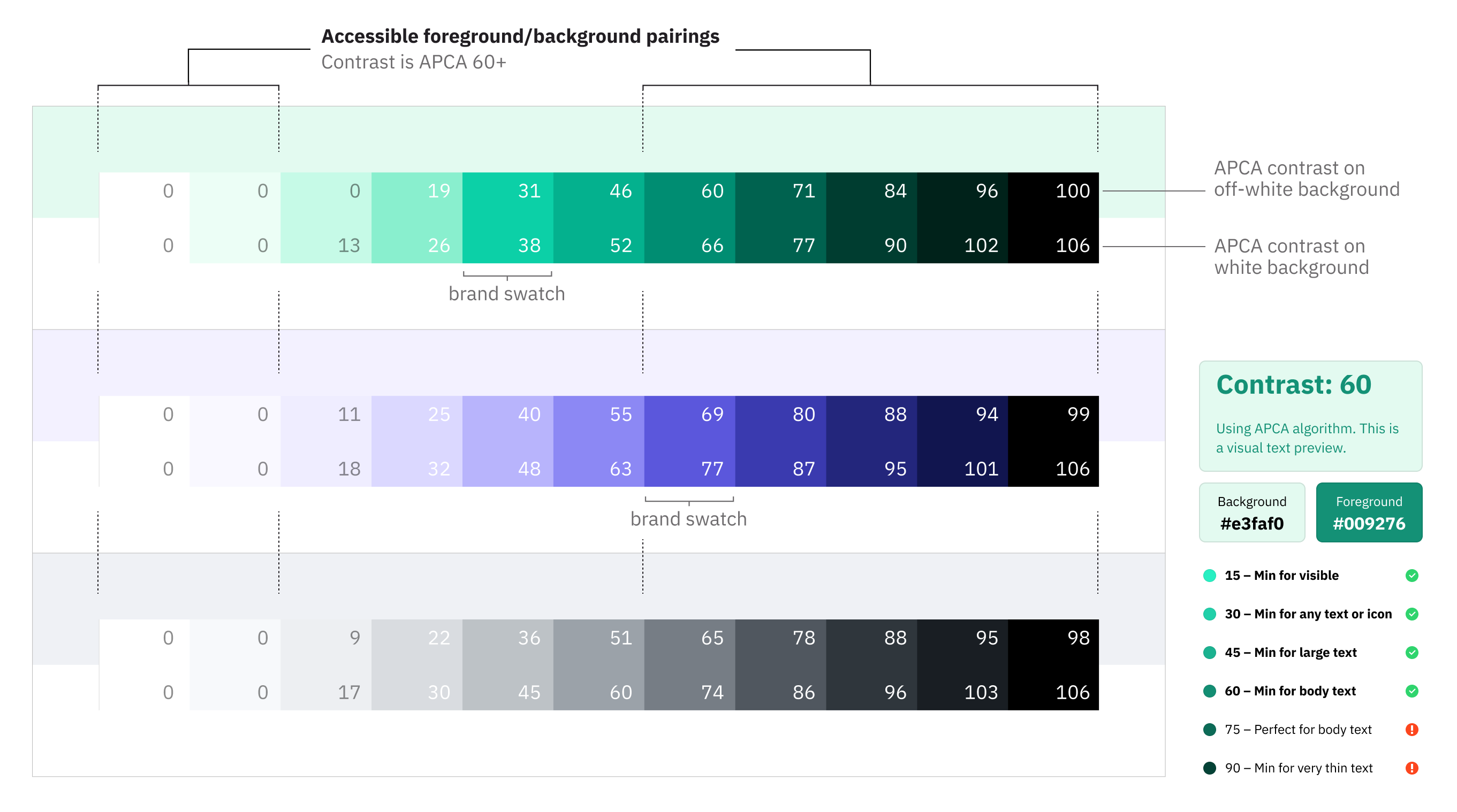
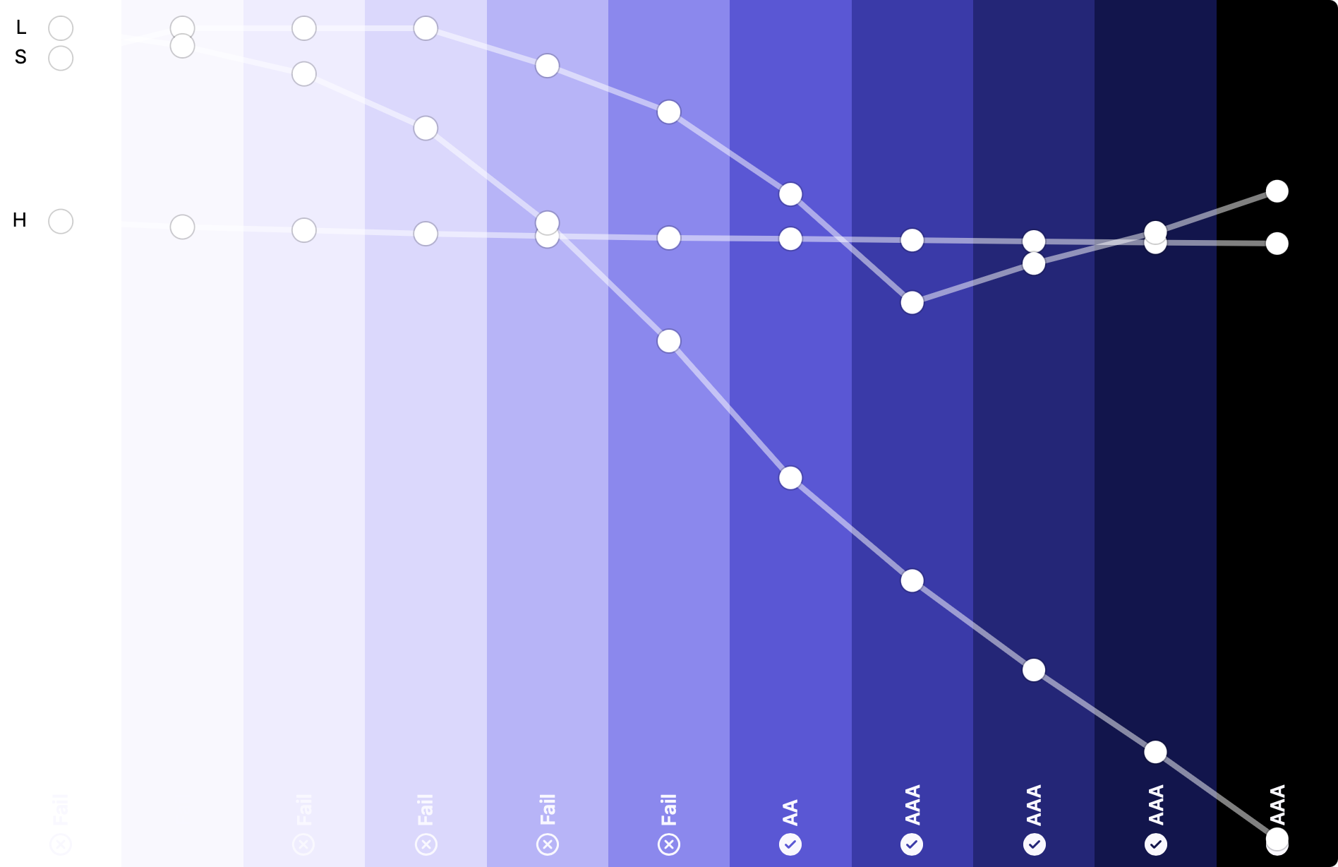
Increasing access and accessibility was a clear thread of feedback from the team during a design visioning workshop I facilitated. Product UIs featured color swatches originally developed for marketing applications. Fundamental elements like headlines and buttons suffered from legibility problems due to poor contrast. I developed 12 scales of color swatches that accounted for each existing brand color yet also met color contrast standards we needed for product use. I helped engineers systematize these scales into color tokens, which made their way to the website, iOS, and Android apps.
Outcomes Through Heuristics
↑17
Percentage-point increase in the rate of patients subscribed to text message reminders.
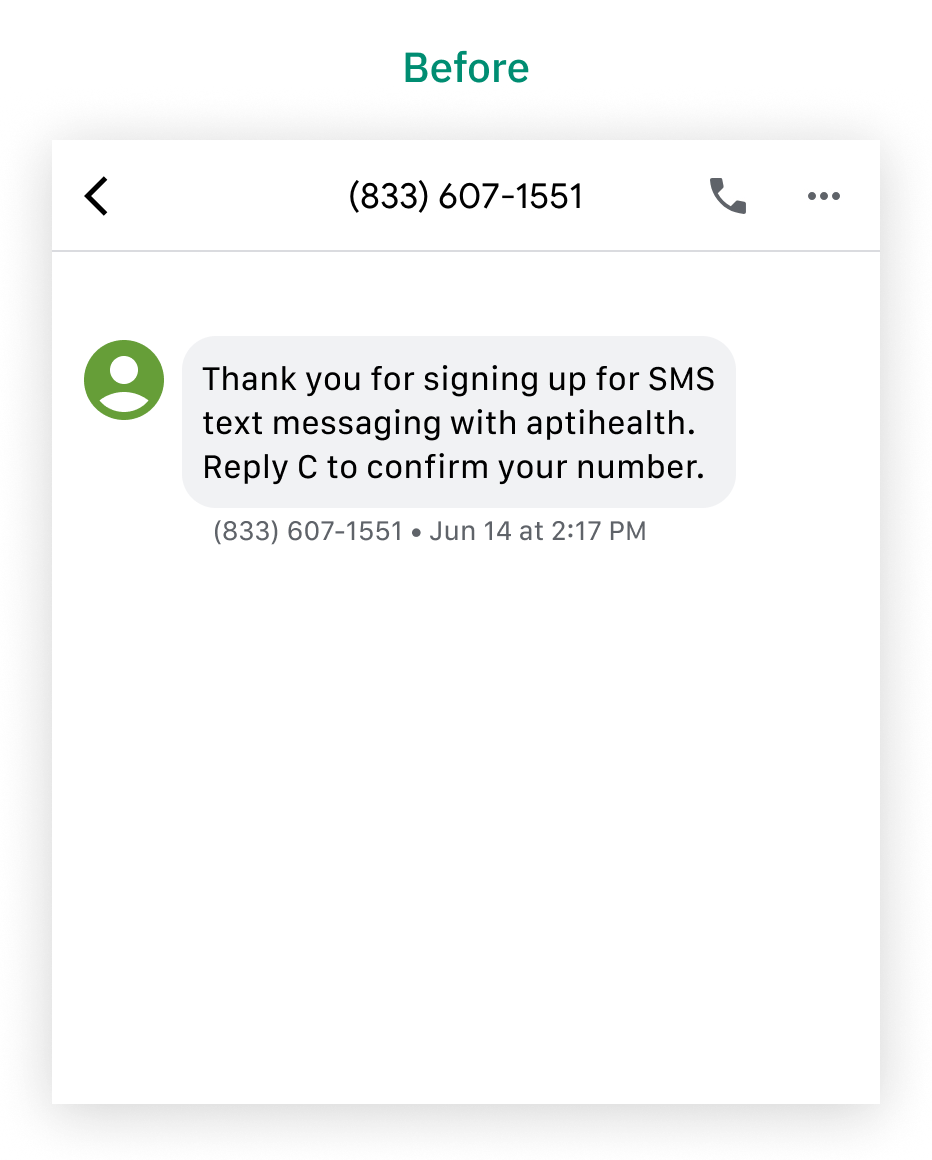
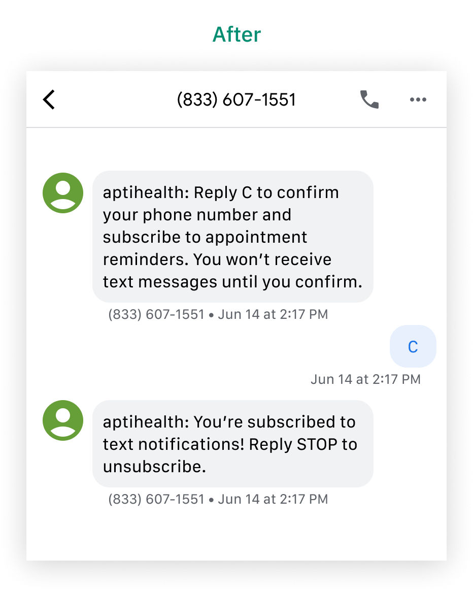
In an environment of patient wait lists, reducing wasted time was important for patient access and the bottom line. When I first got the chance to learn the ins and outs of patient flows in the testing environment, I noticed an opportunity for reducing missed appointments that could be easily tested. The first text message sent to patients who opted to subscribe to appointment reminders was ambiguous. A change in the copy that I made to emphasize what is expected next improved the subscription rate to 57% in the month after the change, after being under 40% consistently for over a year.
Outcomes Through Collaboration
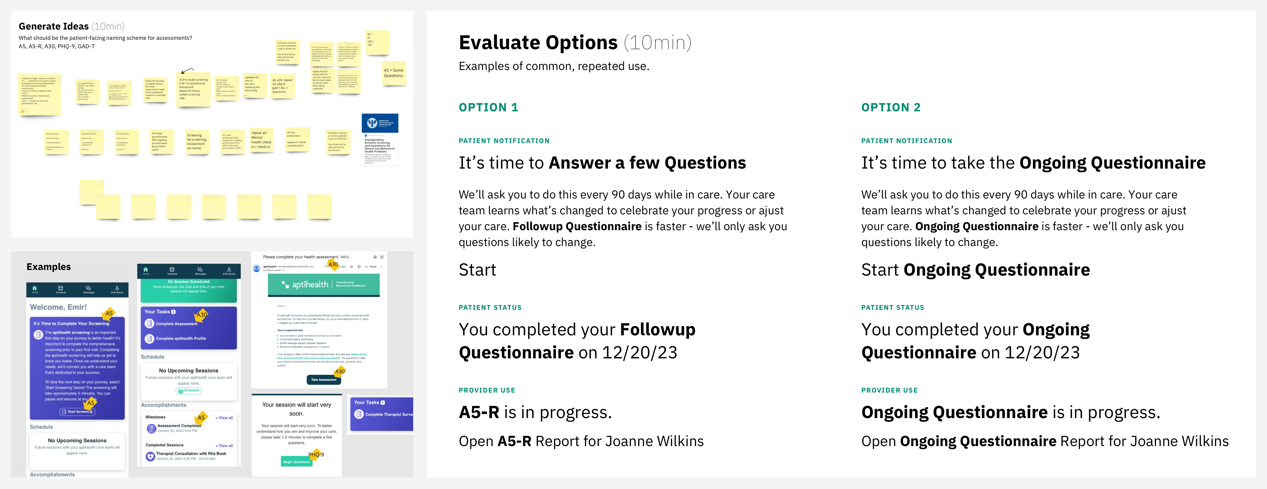
Tasks required of patients before joining their first appointment caused them to be late for or miss their appointments because of confusing language. Clues for whether a task was optional or mandatory were absent. And 5 different clinical questionnaires (each of which has a clinical name that providers could see) were all labeled “assessment” to patients, creating confusion when multiple tasks were mentioned at once.
I ran a workshop with stakeholders from clinical, marketing, and product to generate ideas and get alignment on a more specific naming scheme for patients, which I codified in the content style guide. I leveraged co-creation and workshops of this kind for a variety of other topics. The largest one was a corporate-wide design vision exercise, which provided me and the team with a design roadmap focused on access and inclusion (accessibility). A workshop focused on patient care plans provided insights that improved the consistency of care for patients and credibility for payers. Another workshop focused on the provider panel display uncovered a number of lingering yet easily fixable usability issues.
The Report
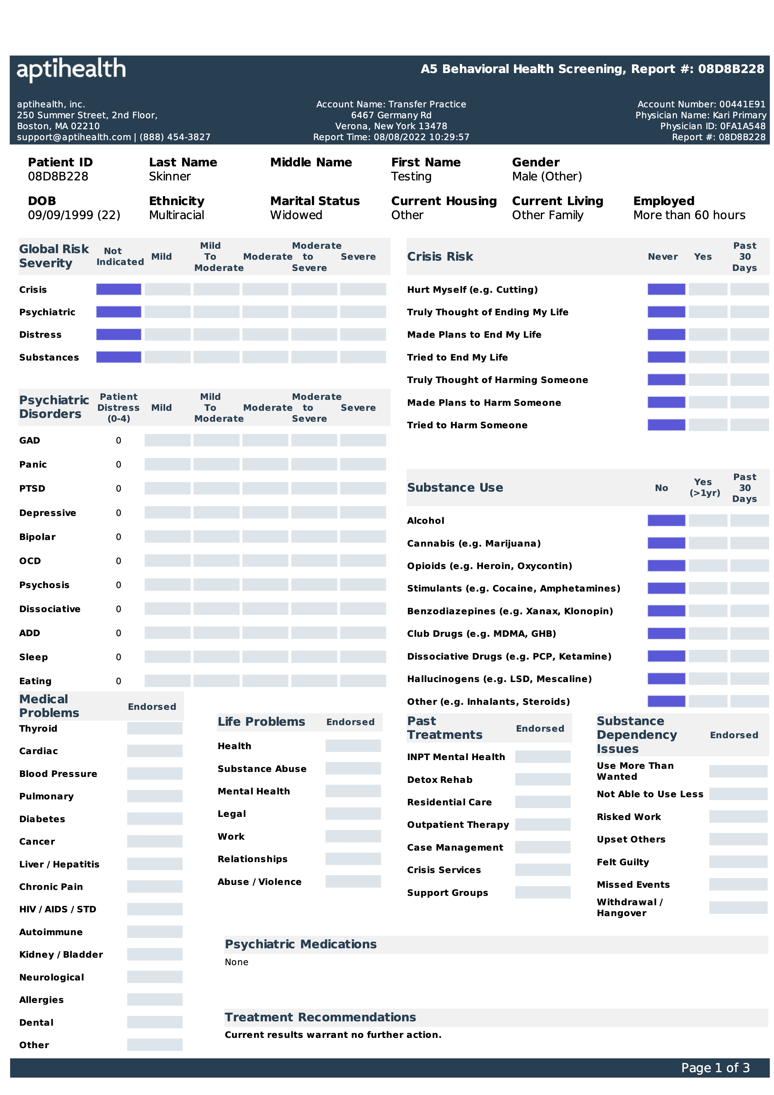
Before
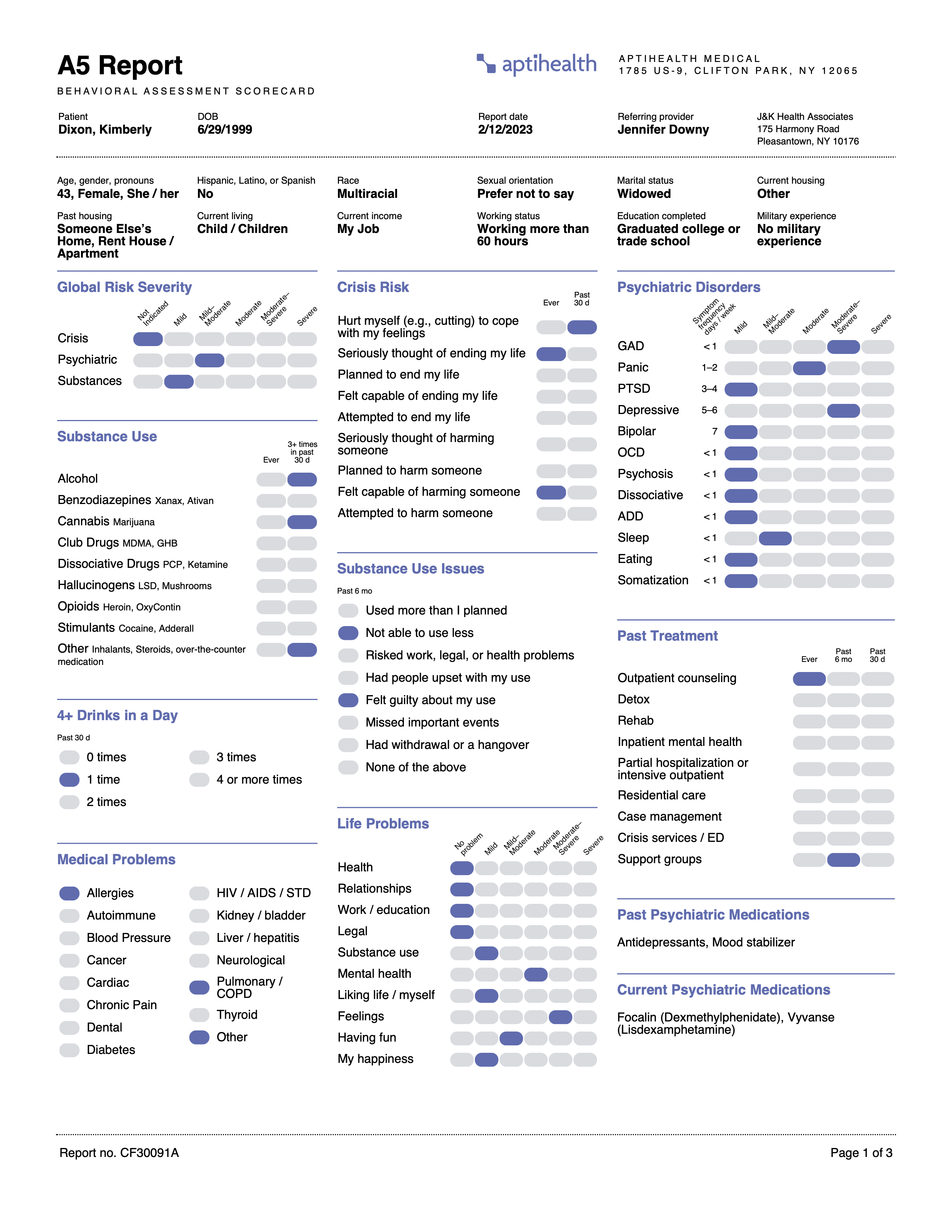
After
The A5 report was created from a proprietary patient questionnaire, which was mandatory for all patients. The report drove just about every aspect of patient care at aptihealth. The team discovered that collating faxed pages of a crucial report was troublesome for users. I was asked to update the report to repeat patients’ info on all 3 pages. Considering the importance of this report, I determined that the layout needed significant improvements. In addition to introducing a repeating header, I redesigned the layout along with the front-end template that generated it. The new layout got enthusiastic reviews from providers that I surveyed. The CMO found the new format clearer enough that he didn’t mind risking the possibility of invalidating a patent he was granted for the report. ▨